Air Quality in Southampton (UK)
Exploring the effect of UK covid 19 lockdown on air quality
Ben Anderson (b.anderson@soton.ac.uk @dataknut)
Last run at: 2020-04-29 17:31:43 (Europe/London)
1 About
1.1 Code
Source:
History:
1.3 Citation
If you wish to refer to any of the material from this report please cite as:
- Anderson, B., (2020) Air Quality in Southampton (UK): Exploring the effect of UK covid 19 lockdown on air quality , Sustainable Energy Research Group, University of Southampton: Southampton, UK.
Report circulation:
- Public
This work is (c) 2020 the University of Southampton and is part of a collection of air quality data analyses.
2 Introduction
sotonAirDT[, `:=`(obsDate, lubridate::date(dateTimeUTC))]
sotonAirDT[, `:=`(year, lubridate::year(dateTimeUTC))]
sotonAirDT[, `:=`(origDoW, lubridate::wday(dateTimeUTC, label = TRUE))]
sotonAirDT[, `:=`(month, lubridate::month(obsDate))]

sotonAirDT[, `:=`(site, ifelse(site == "Southampton A33", "Southampton A33\n(via AURN)", site))]
sotonAirDT[, `:=`(site, ifelse(site == "Southampton Centre", "Southampton Centre\n(via AURN)", site))]

extractDT <- sotonAirDT[!is.na(value)]  # leave out 2016 so we compare with previous 3 years

# this is such a kludge
extractDT[, `:=`(decimalDate, lubridate::decimal_date(obsDate))]  # gives year.% of year

# set to 2020 'dates'
extractDT[, `:=`(date2020, lubridate::as_date(lubridate::date_decimal(2020 + (decimalDate - year))))]  # sets 'year' portion to 2020 so the lockdown annotation works
extractDT[, `:=`(day2020, lubridate::wday(date2020, label = TRUE))]  #

# 2020 Jan 1st = Weds
dt2020 <- extractDT[year == 2020]
dt2020[, `:=`(fixedDate, obsDate)]  # no need to change
dt2020[, `:=`(fixedDoW, lubridate::wday(fixedDate, label = TRUE))]
# table(dt2020$origDoW, dt2020$fixedDoW) head(dt2020[origDoW != fixedDoW])

# shift to the closest aligning day 2019 Jan 1st = Tues
dt2019 <- extractDT[year == 2019]
dt2019[, `:=`(fixedDate, date2020 - 1)]
dt2019[, `:=`(fixedDoW, lubridate::wday(fixedDate, label = TRUE))]
# table(dt2019$origDoW, dt2019$fixedDoW) head(dt2019[origDoW != fixedDoW])

# 2018 Jan 1st = Mon
dt2018 <- extractDT[year == 2018]
dt2018[, `:=`(fixedDate, date2020 - 2)]
dt2018[, `:=`(fixedDoW, lubridate::wday(fixedDate, label = TRUE))]
# table(dt2018$origDoW, dt2018$fixedDoW) head(dt2018[origDoW != fixedDoW])

# 2017 Jan 1st = Sat
dt2017 <- extractDT[year == 2017]
dt2017[, `:=`(fixedDate, date2020 - 3)]
dt2017[, `:=`(fixedDoW, lubridate::wday(fixedDate, label = TRUE))]
# table(dt2017$origDoW, dt2017$fixedDoW) head(dt2017[origDoW != fixedDoW])

fixedDT <- rbind(dt2017, dt2018, dt2019, dt2020)  # leave out 2016 for now

fixedDT[, `:=`(fixedDate, lubridate::as_date(fixedDate))]
fixedDT[, `:=`(fixedDoW, lubridate::wday(fixedDate, label = TRUE))]


fixedDT[, `:=`(compareYear, ifelse(year == 2020, "2020", "2017-2019"))]

# these should match table(fixedDT$origDoW, fixedDT$fixedDoW)

lastHA <- max(fixedDT[source == "hantsAir"]$dateTimeUTC)
diffHA <- lubridate::now() - lastHA
lastAURN <- max(fixedDT[source == "AURN"]$dateTimeUTC)
diffAURN <- lubridate::now() - lastAURN
Data for Southampton downloaded from :
- http://www.hantsair.org.uk/hampshire/asp/Bulletin.asp?la=Southampton (see also https://www.southampton.gov.uk/environmental-issues/pollution/air-quality/);
- https://uk-air.defra.gov.uk/networks/network-info?view=aurn
Southampton City Council collects various forms of air quality data at the sites shown in Table 2.1. The data is available in raw form from http://www.hantsair.org.uk/hampshire/asp/Bulletin.asp?la=Southampton&bulletin=daily&site=SH5.
Some of these sites feed data to AURN. The data that goes via AURN is ratified to check for outliers and instrument/measurement error. AURN data less than six months old has not undergone this process. AURN data is (c) Crown 2020 copyright Defra and available for re-use via https://uk-air.defra.gov.uk, licenced under the Open Government Licence (OGL).
In this report we use data from the following sources:
- http://www.hantsair.org.uk/hampshire/asp/Bulletin.asp?la=Southampton last updated at 2020-04-26 23:00:00;
- https://uk-air.defra.gov.uk/networks/network-info?view=aurn last updated at 2020-04-26 23:00:00.
Table 2.1 shows the available sites and sources. Note that some of the non-AURN sites appear to have stopped updating recently. For a detailed analysis of recent missing data see Section 12.1.
t <- fixedDT[!is.na(value), .(nObs = .N, firstData = min(dateTimeUTC), latestData = max(dateTimeUTC),
    nMeasures = uniqueN(pollutant)), keyby = .(site, source)]

kableExtra::kable(t, caption = "Sites, data source and number of valid observations. note that measures includes wind speed and direction in the AURN sourced data",
digits = 2) %>% kable_styling()| site | source | nObs | firstData | latestData | nMeasures |
|---|---|---|---|---|---|
| Southampton - A33 Roadside (near docks, AURN site) | hantsAir | 82868 | 2017-01-01 00:00:00 | 2020-04-26 23:00:00 | 3 |
| Southampton - Background (near city centre, AURN site) | hantsAir | 157064 | 2017-01-25 11:00:00 | 2020-04-26 23:00:00 | 6 |
| Southampton - Onslow Road (near RSH) | hantsAir | 82232 | 2017-01-01 00:00:00 | 2020-04-15 07:00:00 | 3 |
| Southampton - Victoria Road (Woolston) | hantsAir | 60078 | 2017-01-01 00:00:00 | 2020-04-01 06:00:00 | 3 |
| Southampton A33 (via AURN) | AURN | 214025 | 2017-01-01 00:00:00 | 2020-04-26 23:00:00 | 8 |
| Southampton Centre (via AURN) | AURN | 334734 | 2017-01-01 00:00:00 | 2020-04-26 23:00:00 | 13 |
To avoid confusion and ‘double counting’, in the remainder of the analysis we replace the Southampton AURN site data with the data for the same site sourced via AURN as shown in Table 2.2. This has the disadvantage that the data is slightly less up to date (see Table 2.1). As will be explained below in the comparative analysis we will use only the AURN data to avoid missing data issues.
fixedDT <- fixedDT[!(site %like% "AURN site")]

t <- fixedDT[!is.na(value), .(nObs = .N, nPollutants = uniqueN(pollutant), lastDate = max(dateTimeUTC)),
    keyby = .(site, source)]

kableExtra::kable(t, caption = "Sites, data source and number of valid observations", digits = 2) %>%
kable_styling()| site | source | nObs | nPollutants | lastDate |
|---|---|---|---|---|
| Southampton - Onslow Road (near RSH) | hantsAir | 82232 | 3 | 2020-04-15 07:00:00 |
| Southampton - Victoria Road (Woolston) | hantsAir | 60078 | 3 | 2020-04-01 06:00:00 |
| Southampton A33 (via AURN) | AURN | 214025 | 8 | 2020-04-26 23:00:00 |
| Southampton Centre (via AURN) | AURN | 334734 | 13 | 2020-04-26 23:00:00 |
We use this data to compare:
- pre and during-lockdown air quality measures
- air quality measures during lockdown 2020 with average measures for the preceding 3 years (2017-2019)
It should be noted that air pollution levels on any given day or period of time are highly dependent on the prevailing meteorological conditions. As a result it can be very difficult to disentangle the effects of a reduction in source strength from the effects of local surface conditions. This is abundantly clear in the analysis which follows given that the Easter weekend was forecast to have very high import of pollution from Europe and that the wind direction and speed was highly variable across the lockdown period (see Figure 10.1).
Further, air quality is not wholly driven by sources that lockdown might suppress and indeed that suppression may lead to rebound effects. For example we might expect more emissions due to increased domestic heating during cooler lockdown periods. As a result the analysis presented below must be considered a preliminary ‘before meteorological adjustment’ and ‘before controlling for other sources’ analysis.
For much more detailed analysis see a longer and very messy data report.
3 WHO air quality thresholds
A number of the following plots show the relevant WHO air quality thresholds and limits. These are taken from:
4 Nitrogen Dioxide (no2)
yLab <- "Nitrogen Dioxide (ug/m3)"
no2dt <- fixedDT[pollutant == "no2"]
Figure 4.1 shows the most recent hourly data.
recentDT <- no2dt[obsDate > myParams$recentCutDate]
p <- makeDotPlot(recentDT, xVar = "dateTimeUTC", yVar = "value", byVar = "site", yLab = yLab)

p <- p + scale_x_datetime(date_breaks = "2 day", date_labels = "%a %d %b") + theme(axis.text.x = element_text(angle = 90,
    hjust = 1))

p <- p + geom_hline(yintercept = myParams$hourlyNo2Threshold_WHO) + labs(caption = paste0(myParams$lockdownCap,
    myParams$weekendCap, "\nReference line = WHO hourly threshold (", myParams$hourlyNo2Threshold_WHO,
    ")"))

# final plot - adds annotations
yMin <- min(recentDT$value)
yMax <- max(recentDT$value)

p <- addLockdownDateTime(p, yMin, yMax)
addWeekendsDateTime(p, yMin, yMax) + guides(colour = guide_legend(ncol = 2))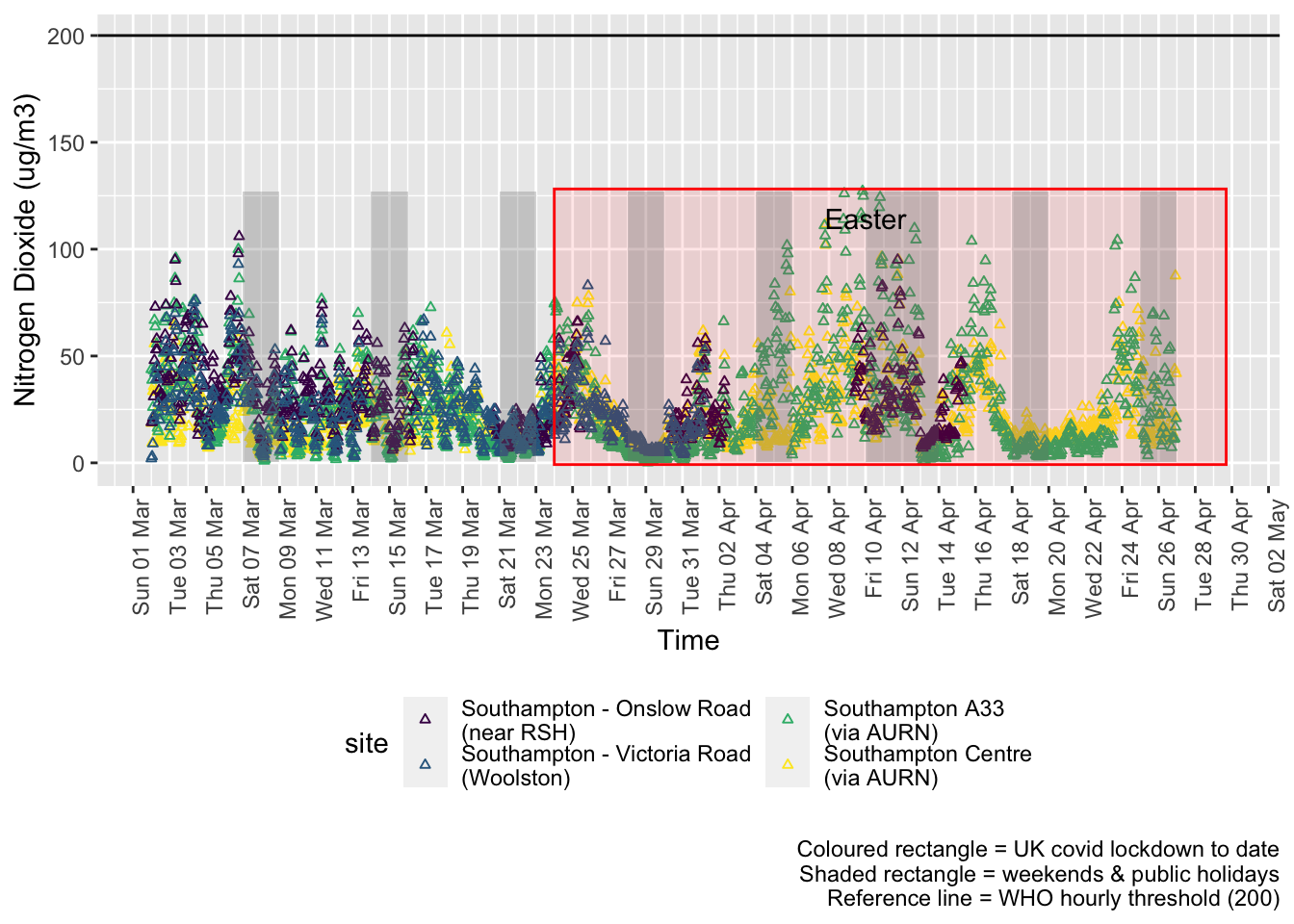
Figure 4.1: Nitrogen Dioxide levels, Southampton (hourly, recent)
Figure 4.2 shows the most recent hourly data by date and time of day.
recentDT[, `:=`(time, hms::as_hms(dateTimeUTC))]
yMin <- min(recentDT$time)
yMax <- max(recentDT$time)
p <- profileTilePlot(recentDT, yLab)
p <- addLockdownDate(p, yMin, yMax)
addWeekendsDate(p, yMin, yMax) + labs(caption = paste0(myParams$lockdownCap, myParams$weekendCap))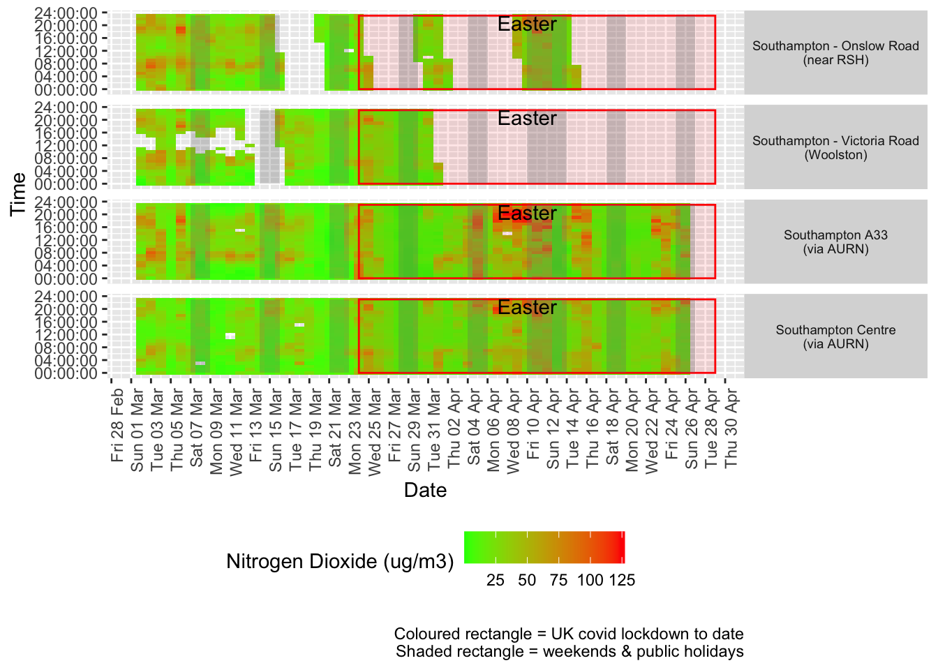
Figure 4.2: Nitrogen Dioxide levels, Southampton (hourly, recent)
Figure 4.3 shows the most recent mean daily values compared to previous years for thw two AURN sites which do not have missing data. We have shifted the dates for the comparison years to ensure that weekdays and weekends line up. Note that this plot shows daily means with no indications of variance. Visible differences are therefore purely indicative at this stage.
plotDT <- no2dt[site %like% "via AURN" & fixedDate <= lubridate::today() & fixedDate >= myParams$comparePlotCut,
    .(meanVal = mean(value), medianVal = median(value), nSites = uniqueN(site)), keyby = .(fixedDate,
        compareYear, site)]

# final plot - adds annotations
yMin <- min(plotDT$meanVal)
yMax <- max(plotDT$meanVal)

p <- compareYearsPlot(plotDT, xVar = "fixedDate", yVar = "meanVal", colVar = "compareYear")

p <- addLockdownDate(p, yMin, yMax) + labs(x = "Date", y = "Daily mean", caption = paste0(myParams$lockdownCap,
    myParams$weekendCap, myParams$noThresh))

p <- addWeekendsDate(p, yMin, yMax) + scale_x_date(date_breaks = "7 day", date_labels = "%a %d %b",
    date_minor_breaks = "1 day")

p + facet_grid(site ~ .) + theme(strip.text.y.right = element_text(angle = 90))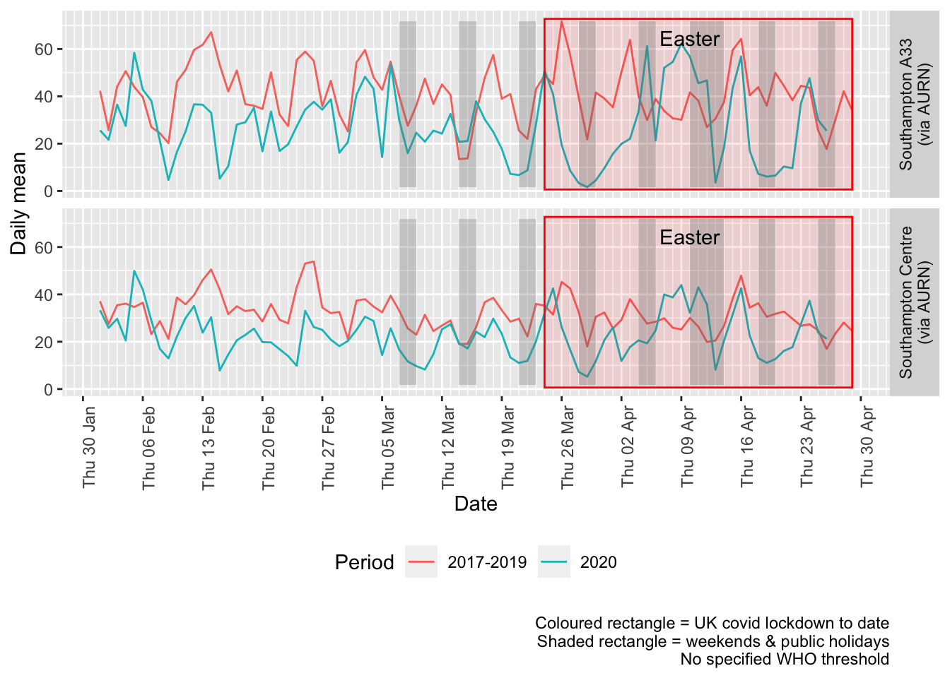
Figure 4.3: Comparative Nitrogen Dioxide levels 2020 vs 2017-2019, Southampton (daily mean)
Figure 4.4 and 4.5 show the % difference between the daily means for 2020 vs 2017-2019 (reference period). In both cases we can see that NO2 levels in 2020 were generally already lower than the reference period yet are not consistently lower even during the lockdown period. The effects of covid lockdown are not clear cut…
testDate <- myParams$comparePlotCut
# testDate <- as.Date('2020-03-21')
compareYearsDiffPlotDaily(no2dt[site %like% "via AURN" & fixedDate >= testDate]) + labs(caption = paste0(myParams$lockdownCap,
    myParams$weekendCap))
## [1] "Max drop %:-92"
## [1] "Max increase %:125"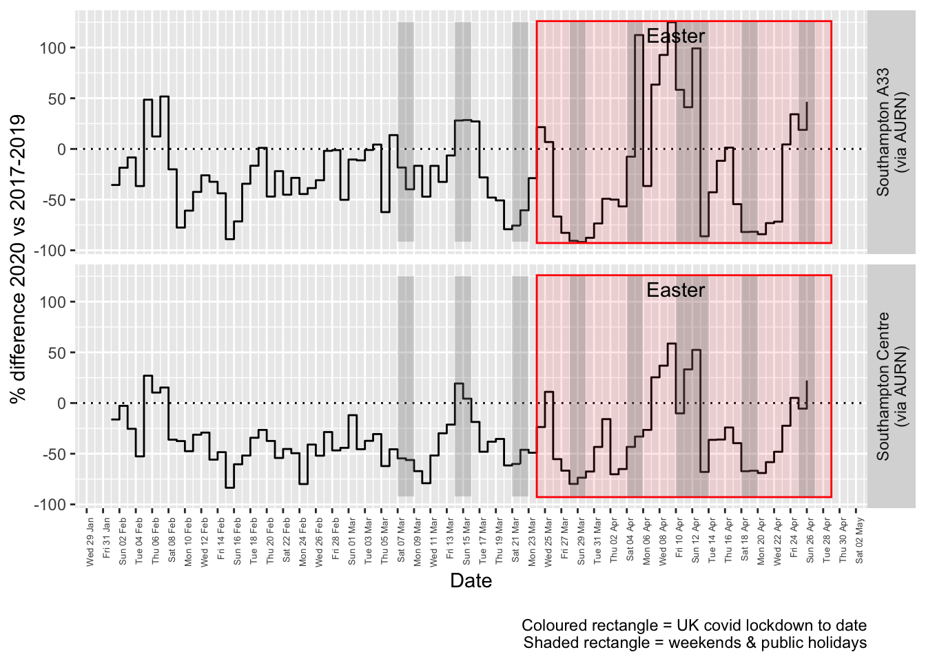
Figure 4.4: Percentage difference in daily mean Nitrogen Dioxide levels 2020 vs 2017-2019, Southampton
compareYearsDiffPlotWeekly(no2dt[site %like% "via AURN" & fixedDate >= myParams$comparePlotCut]) +
    labs(caption = paste0(myParams$lockdownCap))
Figure 4.5: Percentage difference in weekly mean Nitrogen Dioxide levels 2020 vs 2017-2019, Southampton
Beware seasonal trends and meteorological effects
5 Oxides of Nitrogen (nox)
yLab <- "Oxides of Nitrogen (ug/m3)"
noxdt <- fixedDT[pollutant == "nox"]
Figure 5.1 shows the most recent hourly data.
recentDT <- noxdt[!is.na(value) & obsDate > myParams$recentCutDate]
p <- makeDotPlot(recentDT, xVar = "dateTimeUTC", yVar = "value", byVar = "site", yLab = yLab)

p <- p + scale_x_datetime(date_breaks = "2 day", date_labels = "%a %d %b") + theme(axis.text.x = element_text(angle = 90,
    hjust = 1)) + labs(caption = paste0(myParams$lockdownCap, myParams$weekendCap, myParams$noThresh))

# final plot - adds annotations
yMin <- min(recentDT$value)
yMax <- max(recentDT$value)

p <- addLockdownDateTime(p, yMin, yMax)

addWeekendsDateTime(p, yMin, yMax)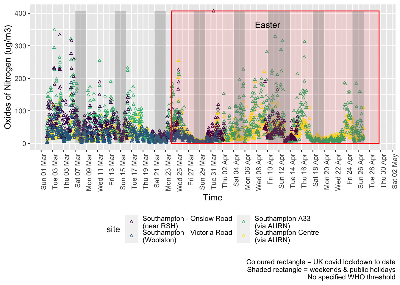
Figure 5.1: Oxides of nitrogen levels, Southampton (hourly, recent)
Figure 5.2 shows the most recent hourly data by date and time of day.
recentDT[, `:=`(time, hms::as_hms(dateTimeUTC))]
yMin <- min(recentDT$time)
yMax <- max(recentDT$time)
p <- profileTilePlot(recentDT, yLab)
addWeekendsDate(p, yMin, yMax) + labs(caption = paste0(myParams$lockdownCap, myParams$weekendCap))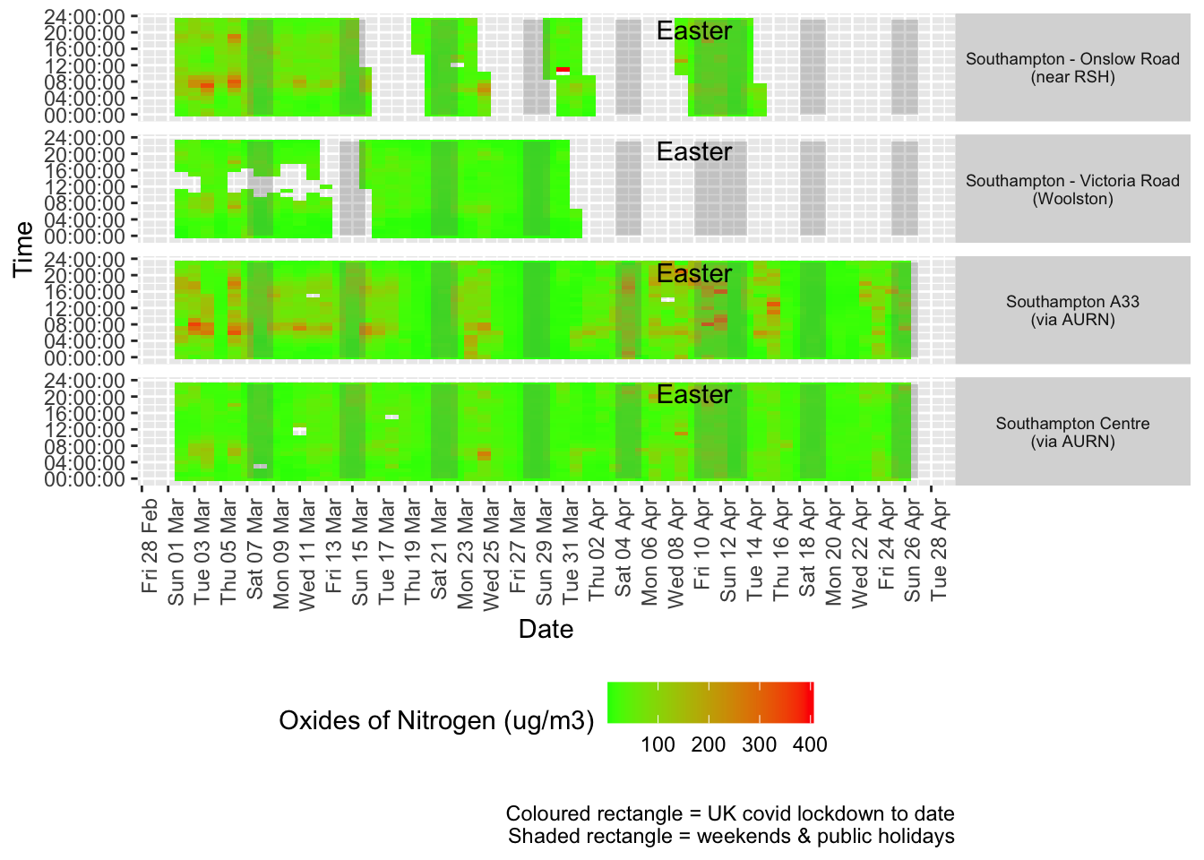
Figure 5.2: Oxides of nitrogen levels, Southampton (hourly, recent)
Figure 5.3 shows the most recent mean daily values compared to previous years for the two AURN sites.
plotDT <- noxdt[site %like% "via AURN" & fixedDate <= lubridate::today() & fixedDate >= myParams$comparePlotCut,
    .(meanVal = mean(value), medianVal = median(value), nSites = uniqueN(site)), keyby = .(fixedDate,
        compareYear, site)]

# final plot - adds annotations
yMin <- min(plotDT$meanVal)
yMax <- max(plotDT$meanVal)

p <- compareYearsPlot(plotDT, xVar = "fixedDate", yVar = "meanVal", colVar = "compareYear")
p <- addLockdownDate(p, yMin, yMax) + labs(x = "Date", y = "Daily mean", caption = paste0(myParams$lockdownCap,
    myParams$weekendCap, myParams$noThresh))
p <- addWeekendsDate(p, yMin, yMax)

p + facet_grid(site ~ .) + theme(strip.text.y.right = element_text(angle = 90))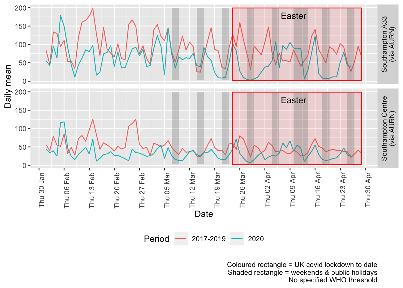
Figure 5.3: Oxides of nitrogen levels, Southampton (daily mean)
Figure 5.4 and 5.5 show the % difference between the daily and weekly means for 2020 vs 2017-2019 (reference period).
compareYearsDiffPlotDaily(noxdt[site %like% "via AURN" & fixedDate >= myParams$comparePlotCut]) +
    labs(caption = paste0(myParams$lockdownCap, myParams$weekendCap))
## [1] "Max drop %:-92"
## [1] "Max increase %:172"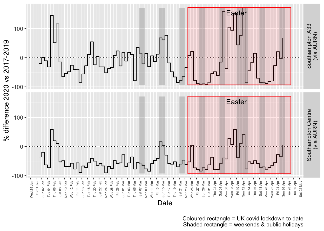
Figure 5.4: % difference in daily mean Oxides of Nitrogen levels 2020 vs 2017-2019, Southampton
compareYearsDiffPlotWeekly(noxdt[site %like% "via AURN" & fixedDate >= myParams$comparePlotCut]) +
    labs(caption = paste0(myParams$lockdownCap))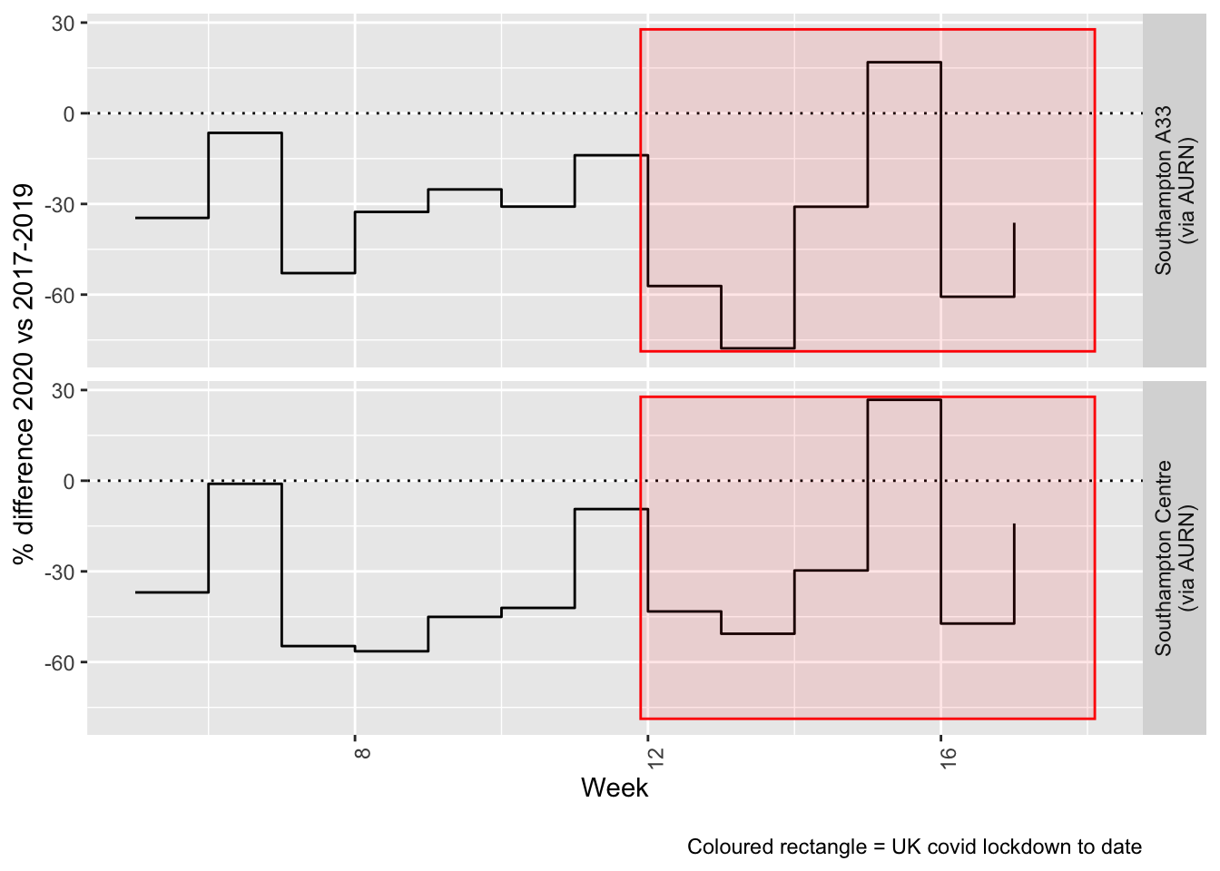
Figure 5.5: % difference in weekly mean Oxides of Nitrogen levels 2020 vs 2017-2019, Southampton
6 Sulphour Dioxide
yLab <- "Sulphour Dioxide (ug/m3)"
so2dt <- fixedDT[pollutant == "so2"]
Figure 6.1 shows the most recent hourly data.
recentDT <- so2dt[!is.na(value) & obsDate > myParams$recentCutDate]
p <- makeDotPlot(recentDT, xVar = "dateTimeUTC", yVar = "value", byVar = "site", yLab = yLab)

p <- p + scale_x_datetime(date_breaks = "2 day", date_labels = "%a %d %b") + theme(axis.text.x = element_text(angle = 90,
    hjust = 1)) + labs(caption = paste0(myParams$lockdownCap, myParams$weekendCap, myParams$noThresh))

yMax <- max(recentDT$value)
yMin <- min(recentDT$value)
p <- addLockdownDateTime(p, yMin, yMax)
addWeekendsDateTime(p, yMin, yMax)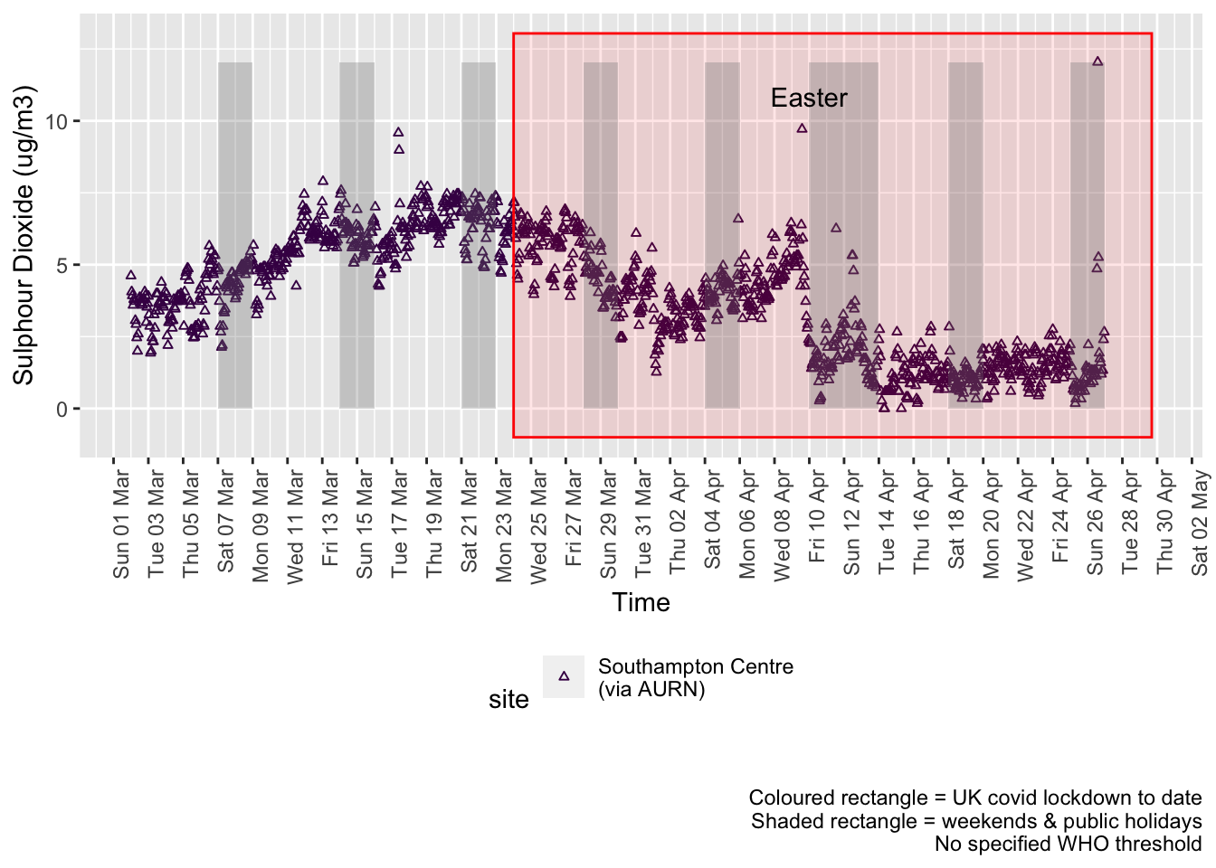
Figure 6.1: Sulphour Dioxide levels, Southampton (hourly, recent)
Figure 6.2 shows the most recent hourly data by date and time of day and time of day.
recentDT[, `:=`(time, hms::as_hms(dateTimeUTC))]

yMin <- min(recentDT$time)
yMax <- max(recentDT$time)
p <- profileTilePlot(recentDT, yLab)
addWeekendsDate(p, yMin, yMax) + labs(caption = paste0(myParams$lockdownCap, myParams$weekendCap))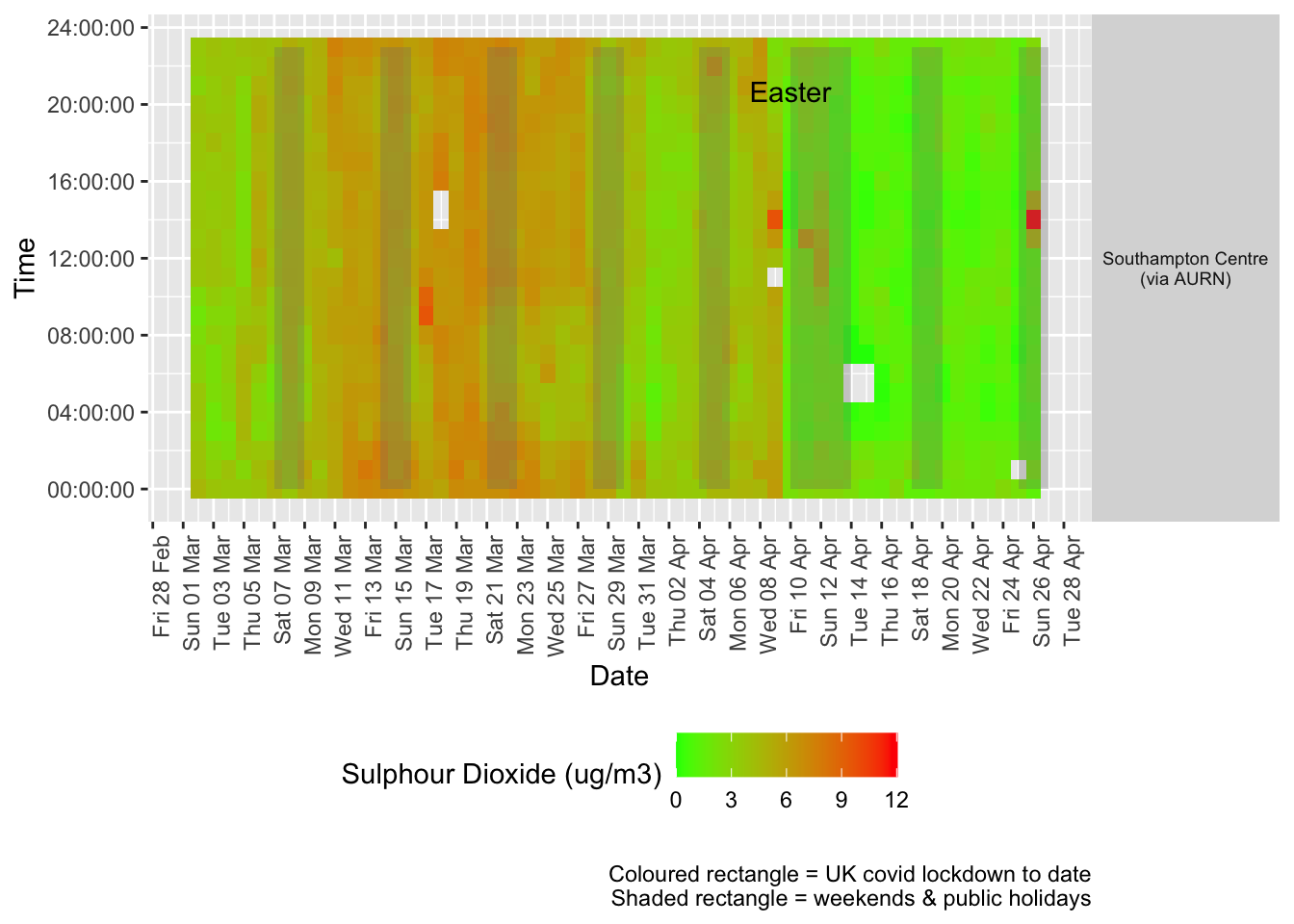
Figure 6.2: Sulphour Dioxide levels, Southampton (hourly, recent)
Figure 6.3 shows the most recent mean daily values compared to previous years.
plotDT <- so2dt[site %like% "via AURN" & fixedDate <= lubridate::today() & fixedDate >= myParams$comparePlotCut,
    .(meanVal = mean(value), medianVal = median(value), nSites = uniqueN(site)), keyby = .(fixedDate,
        compareYear, site)]

# final plot - adds annotations
yMin <- min(plotDT$mean)
yMax <- max(plotDT$mean)

p <- compareYearsPlot(plotDT, xVar = "fixedDate", yVar = "meanVal", colVar = "compareYear")
p <- addLockdownDate(p, yMin, yMax) + geom_hline(yintercept = myParams$dailySo2Threshold_WHO) + labs(x = "Date",
    y = "Daily mean", caption = paste0(myParams$lockdownCap, myParams$weekendCap, "\nReference line = WHO daily threshold (",
        myParams$dailySo2Threshold_WHO, ")"))
p <- addWeekendsDate(p, yMin, yMax)

p + facet_grid(site ~ .) + theme(strip.text.y.right = element_text(angle = 90))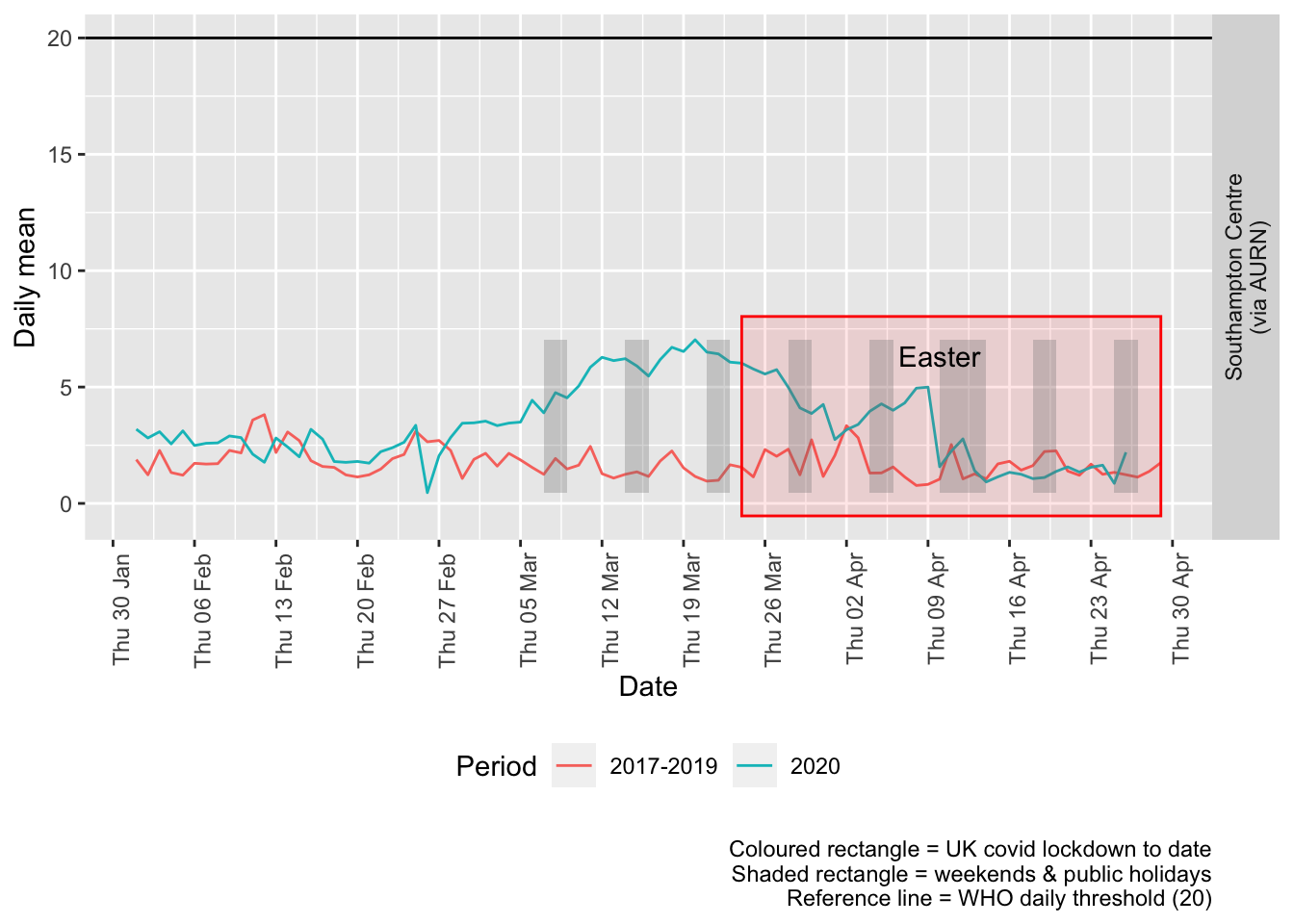
Figure 6.3: Sulphour dioxide levels, Southampton (daily mean)
Figure 6.4 and 6.5 show the % difference between the daily and weekly means for 2020 vs 2017-2019 (reference period).
compareYearsDiffPlotDaily(so2dt[site %like% "via AURN" & fixedDate >= myParams$comparePlotCut]) +
    labs(caption = paste0(myParams$lockdownCap, myParams$weekendCap))
## [1] "Max drop %:-83"
## [1] "Max increase %:579"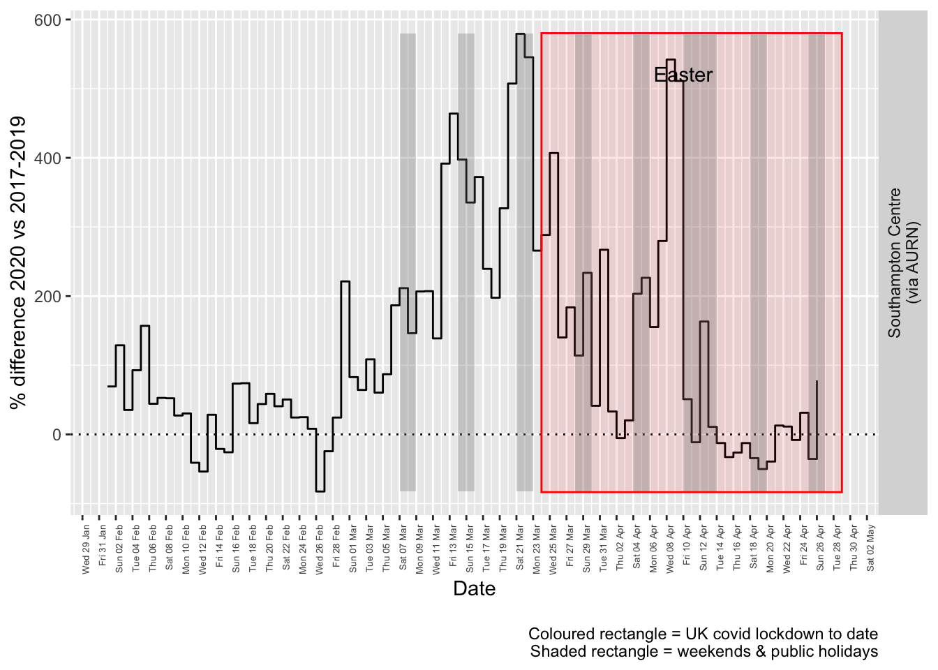
Figure 6.4: % difference in daily mean Sulphour Dioxide levels 2020 vs 2017-2019, Southampton
compareYearsDiffPlotWeekly(so2dt[site %like% "via AURN" & fixedDate >= myParams$comparePlotCut]) +
    labs(caption = paste0(myParams$lockdownCap))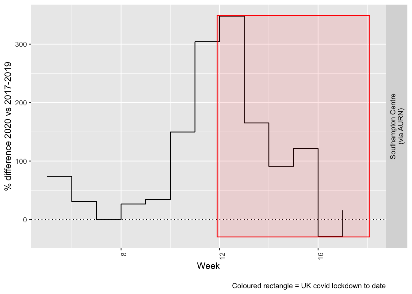
Figure 6.5: % difference in weekly mean Sulphour Dioxide levels 2020 vs 2017-2019, Southampton
Beware seasonal trends and meteorological effects
7 Ozone
yLab <- "Ozone (ug/m3)"
o3dt <- fixedDT[pollutant == "o3"]
Figure 7.1 shows the most recent hourly data.
recentDT <- o3dt[!is.na(value) & obsDate > myParams$recentCutDate]
p <- makeDotPlot(recentDT, xVar = "dateTimeUTC", yVar = "value", byVar = "site", yLab = yLab)

p <- p + scale_x_datetime(date_breaks = "2 day", date_labels = "%a %d %b") + theme(axis.text.x = element_text(angle = 90,
    hjust = 1)) + labs(caption = paste0(myParams$lockdownCap, myParams$weekendCap, myParams$noThresh))

yMax <- max(recentDT$value)
yMin <- min(recentDT$value)
p <- addLockdownDateTime(p, yMin, yMax)
addWeekendsDateTime(p, yMin, yMax)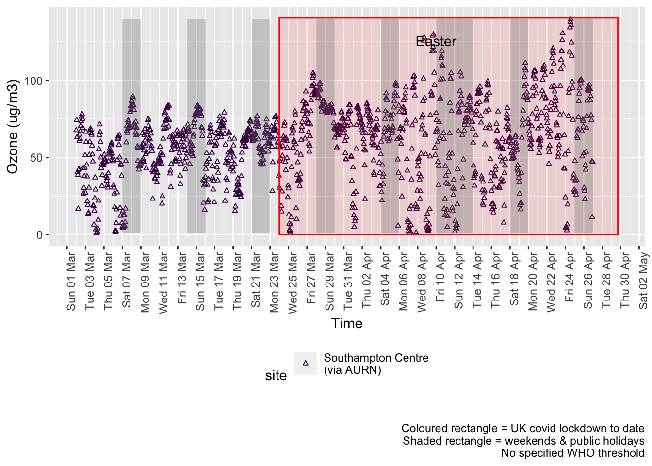
Figure 7.1: 03 levels, Southampton (hourly, recent)
Figure 7.2 shows the most recent hourly data by date and time of day.
recentDT[, `:=`(time, hms::as_hms(dateTimeUTC))]

yMin <- min(recentDT$time)
yMax <- max(recentDT$time)
p <- profileTilePlot(recentDT, yLab)
addWeekendsDate(p, yMin, yMax) + labs(caption = paste0(myParams$lockdownCap, myParams$weekendCap))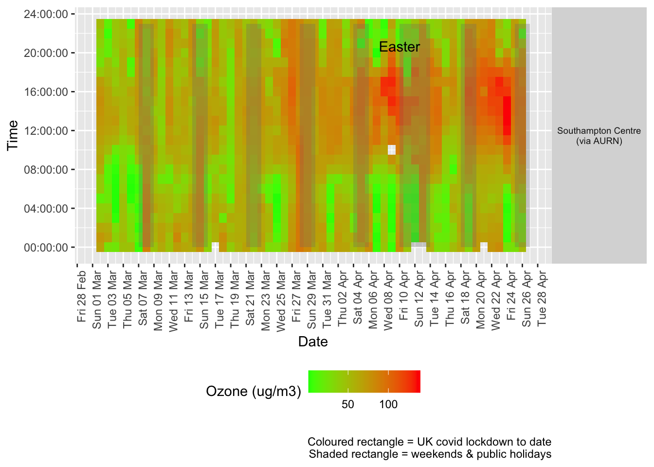
Figure 7.2: Ozone levels, Southampton (hourly, recent)
Figure 7.3 shows the most recent mean daily values compared to previous years.
plotDT <- o3dt[site %like% "via AURN" & fixedDate <= lubridate::today() & fixedDate >= myParams$comparePlotCut,
    .(meanVal = mean(value), medianVal = median(value), nSites = uniqueN(site)), keyby = .(fixedDate,
        compareYear, site)]

# final plot - adds annotations
yMin <- min(plotDT$mean)
yMax <- max(plotDT$mean)

p <- compareYearsPlot(plotDT, xVar = "fixedDate", yVar = "meanVal", colVar = "compareYear")
p <- addLockdownDate(p, yMin, yMax) + geom_hline(yintercept = myParams$dailyO3Threshold_WHO) + labs(x = "Date",
    y = "Daily mean", caption = paste0(myParams$lockdownCap, myParams$weekendCap, "\nReference line = WHO daily threshold (",
        myParams$dailyO3Threshold_WHO, ")"))
p <- addWeekendsDate(p, yMin, yMax)
p + facet_grid(site ~ .) + theme(strip.text.y.right = element_text(angle = 90))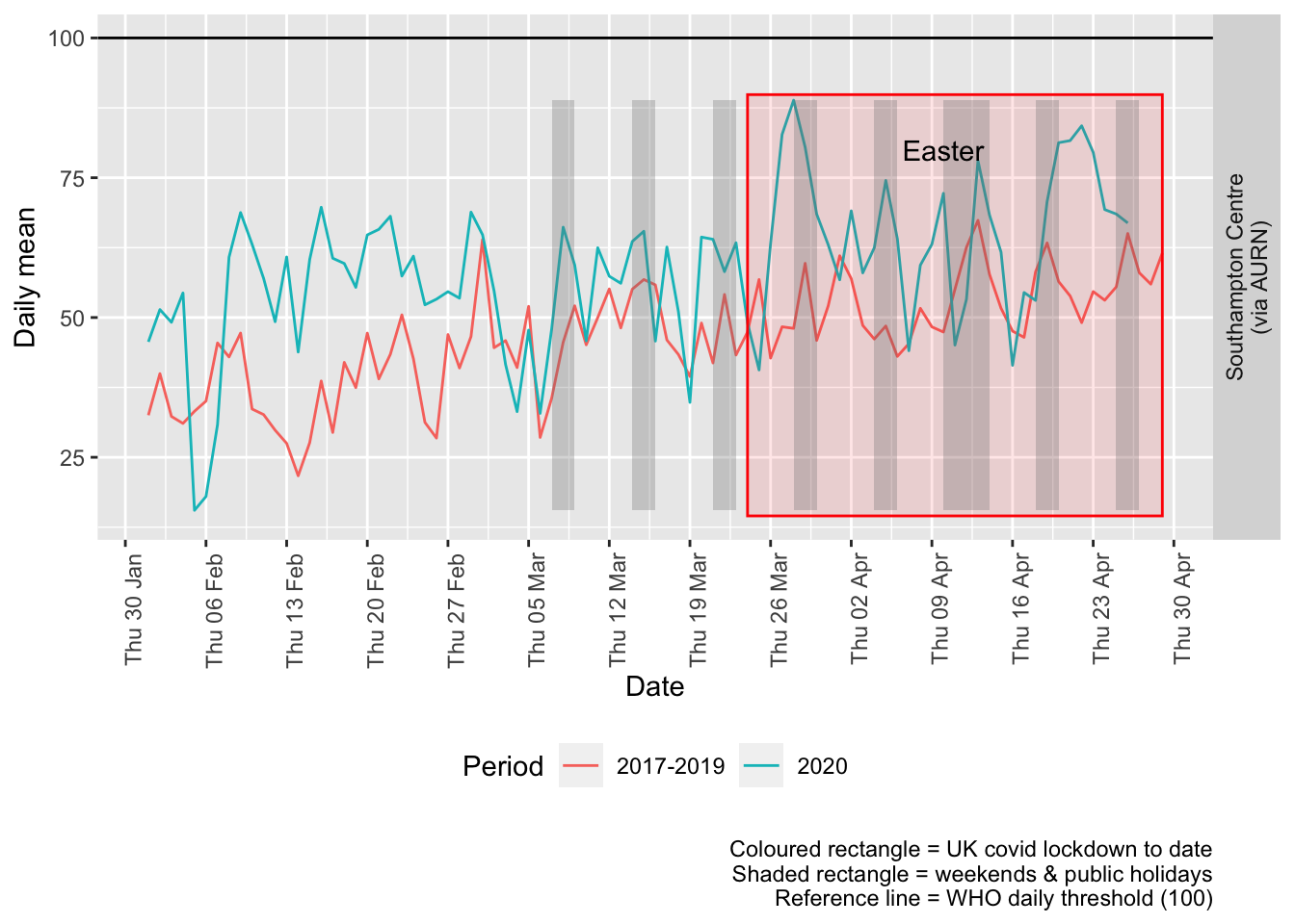
Figure 7.3: Ozone levels, Southampton (daily mean)
Figure 7.4 and 7.5 show the % difference between the daily and weekly means for 2020 vs 2017-2019 (reference period).
compareYearsDiffPlotDaily(o3dt[site %like% "via AURN" & fixedDate >= myParams$comparePlotCut]) + labs(caption = paste0(myParams$lockdownCap,
    myParams$weekendCap))
## [1] "Max drop %:-53"
## [1] "Max increase %:121"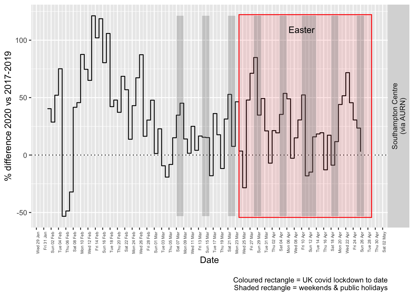
Figure 7.4: % difference in daily mean Ozone levels 2020 vs 2017-2019, Southampton
compareYearsDiffPlotWeekly(no2dt[site %like% "via AURN" & fixedDate >= myParams$comparePlotCut]) +
    labs(caption = paste0(myParams$lockdownCap))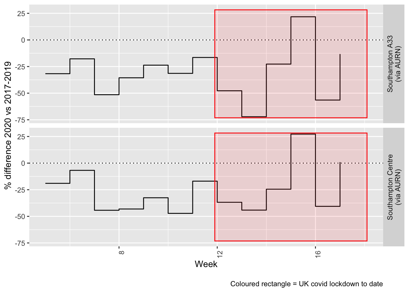
Figure 7.5: % difference in weekly mean Ozone levels 2020 vs 2017-2019, Southampton
Beware seasonal trends and meteorological effects
8 PM 10
yLab <- "PM 10 (ug/m3)"
pm10dt <- fixedDT[pollutant == "pm10"]
Figure 8.1 shows the most recent hourly data.
recentDT <- pm10dt[!is.na(value) & obsDate > myParams$recentCutDate]
p <- makeDotPlot(recentDT, xVar = "dateTimeUTC", yVar = "value", byVar = "site", yLab = yLab)

p <- p + scale_x_datetime(date_breaks = "2 day", date_labels = "%a %d %b") + theme(axis.text.x = element_text(angle = 90,
    hjust = 1)) + labs(caption = paste0(myParams$lockdownCap, myParams$weekendCap, myParams$noThresh))

yMax <- max(recentDT$value)
yMin <- min(recentDT$value)
p <- addLockdownDateTime(p, yMin, yMax)
addWeekendsDateTime(p, yMin, yMax)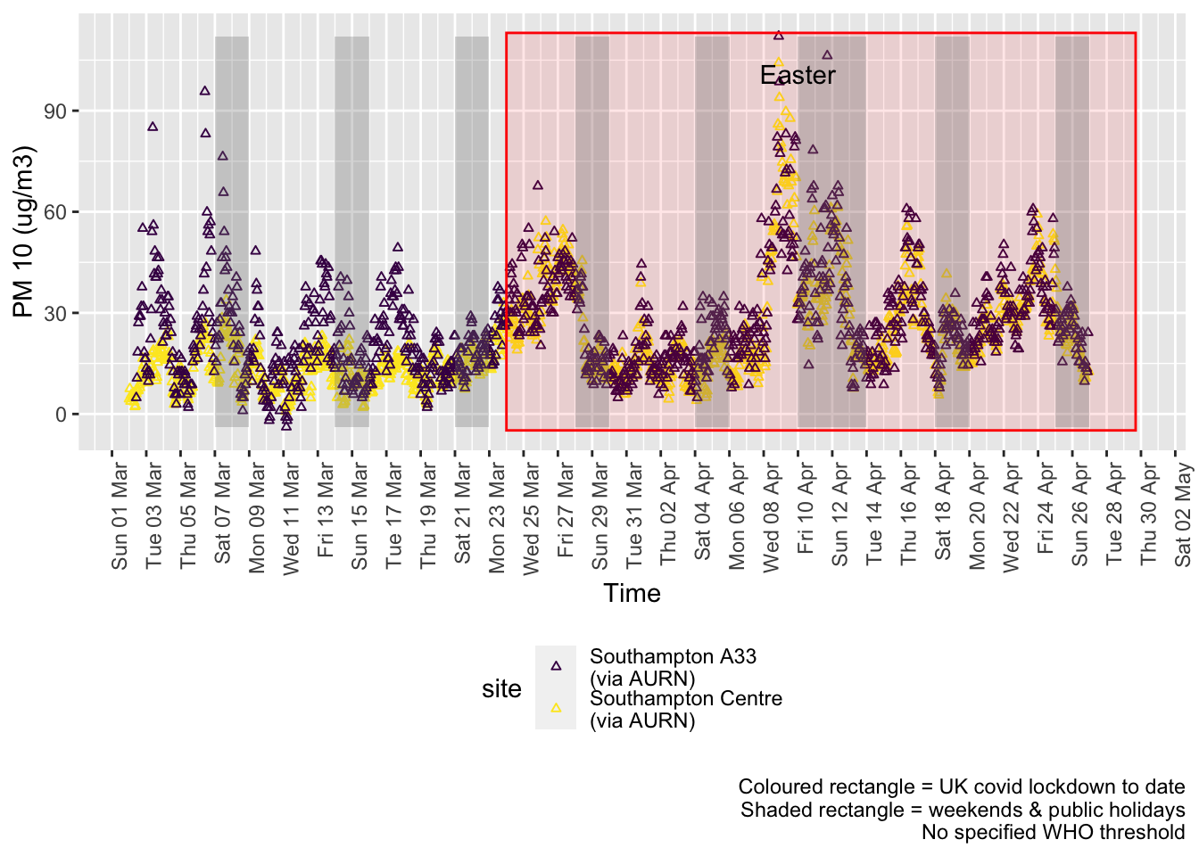
Figure 8.1: PM10 levels, Southampton (hourly, recent)
Figure 8.2 shows the most recent hourly data by date and time of day.
recentDT[, `:=`(time, hms::as_hms(dateTimeUTC))]

yMin <- min(recentDT$time)
yMax <- max(recentDT$time)
p <- profileTilePlot(recentDT, yLab)
addWeekendsDate(p, yMin, yMax) + labs(caption = paste0(myParams$lockdownCap, myParams$weekendCap))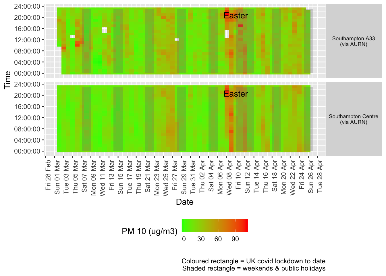
Figure 8.2: PM10 levels, Southampton (hourly, recent)
Figure 8.3 shows the most recent mean daily values compared to previous years.
plotDT <- pm10dt[site %like% "via AURN" & fixedDate <= lubridate::today() & fixedDate >= myParams$comparePlotCut,
    .(meanVal = mean(value), medianVal = median(value), nSites = uniqueN(site)), keyby = .(fixedDate,
        compareYear, site)]

# final plot - adds annotations
yMin <- min(plotDT$mean)
yMax <- max(plotDT$mean)

p <- compareYearsPlot(plotDT, xVar = "fixedDate", yVar = "meanVal", colVar = "compareYear")
p <- addLockdownDate(p, yMin, yMax) + geom_hline(yintercept = myParams$dailyPm10Threshold_WHO) + labs(x = "Date",
    y = "Daily mean", caption = paste0(myParams$lockdownCap, myParams$weekendCap, "\nReference line = WHO daily threshold (",
        myParams$dailyPm10Threshold_WHO, ")"))
p <- addWeekendsDate(p, yMin, yMax)
p + facet_grid(site ~ .) + theme(strip.text.y.right = element_text(angle = 90))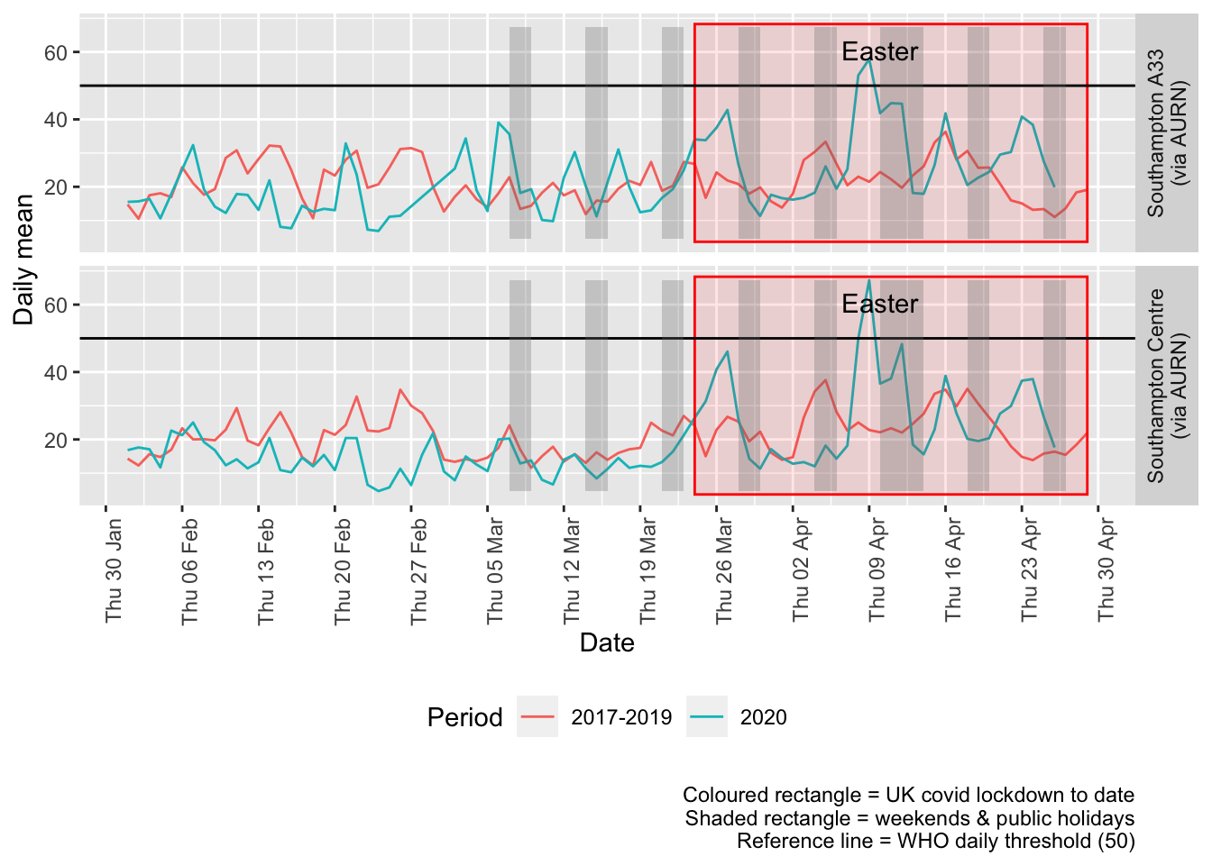
Figure 8.3: PM10 levels, Southampton (daily mean)
Figure 8.4 and 8.5 show the % difference between the daily and weekly means for 2020 vs 2017-2019 (reference period).
compareYearsDiffPlotDaily(pm10dt[site %like% "via AURN" & fixedDate >= myParams$comparePlotCut]) +
    labs(caption = paste0(myParams$lockdownCap, myParams$weekendCap))
## [1] "Max drop %:-79"
## [1] "Max increase %:203"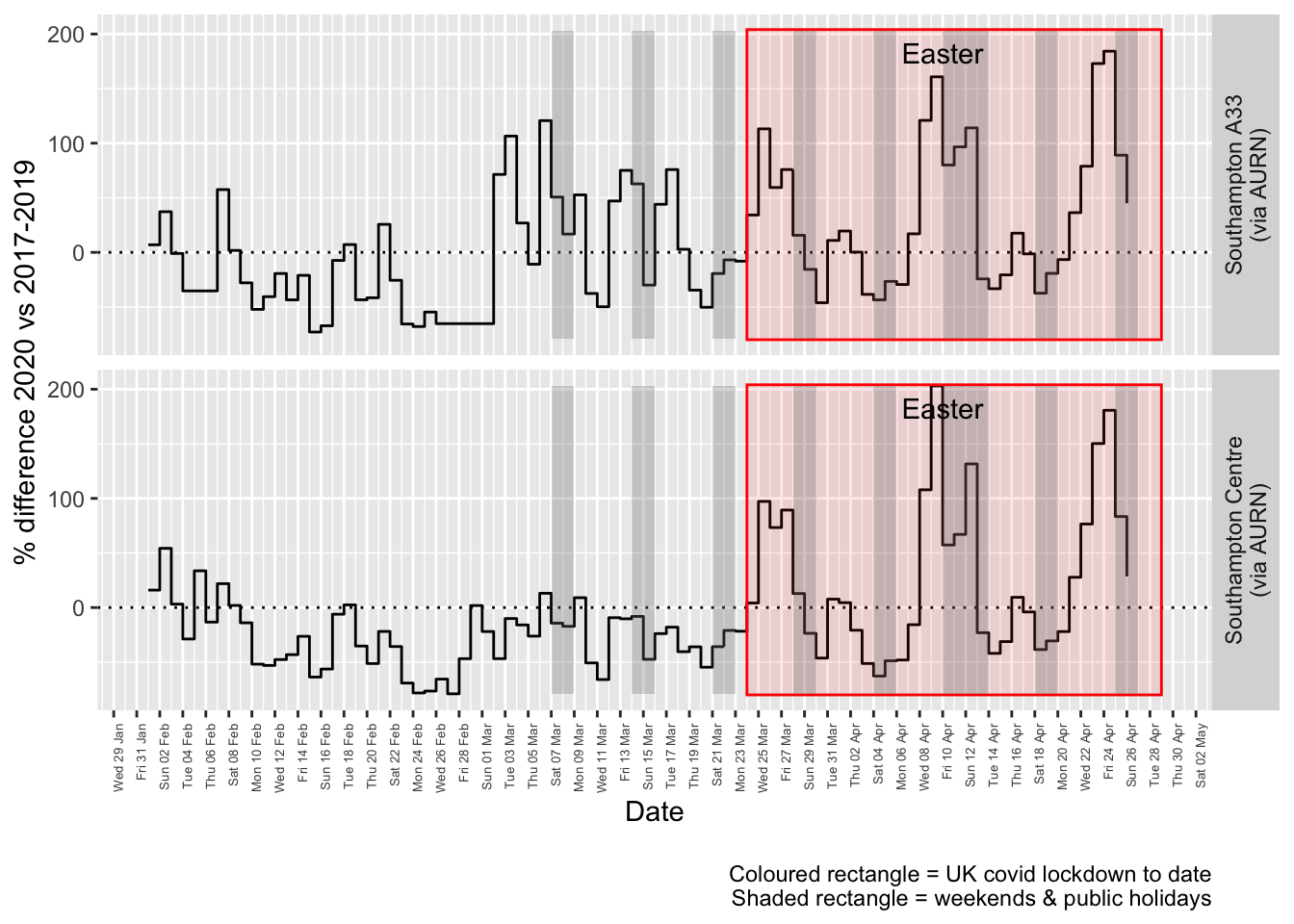
Figure 8.4: % difference in daily mean PM10 levels 2020 vs 2017-2019, Southampton
compareYearsDiffPlotWeekly(pm10dt[site %like% "via AURN" & fixedDate >= myParams$comparePlotCut]) +
    labs(caption = paste0(myParams$lockdownCap))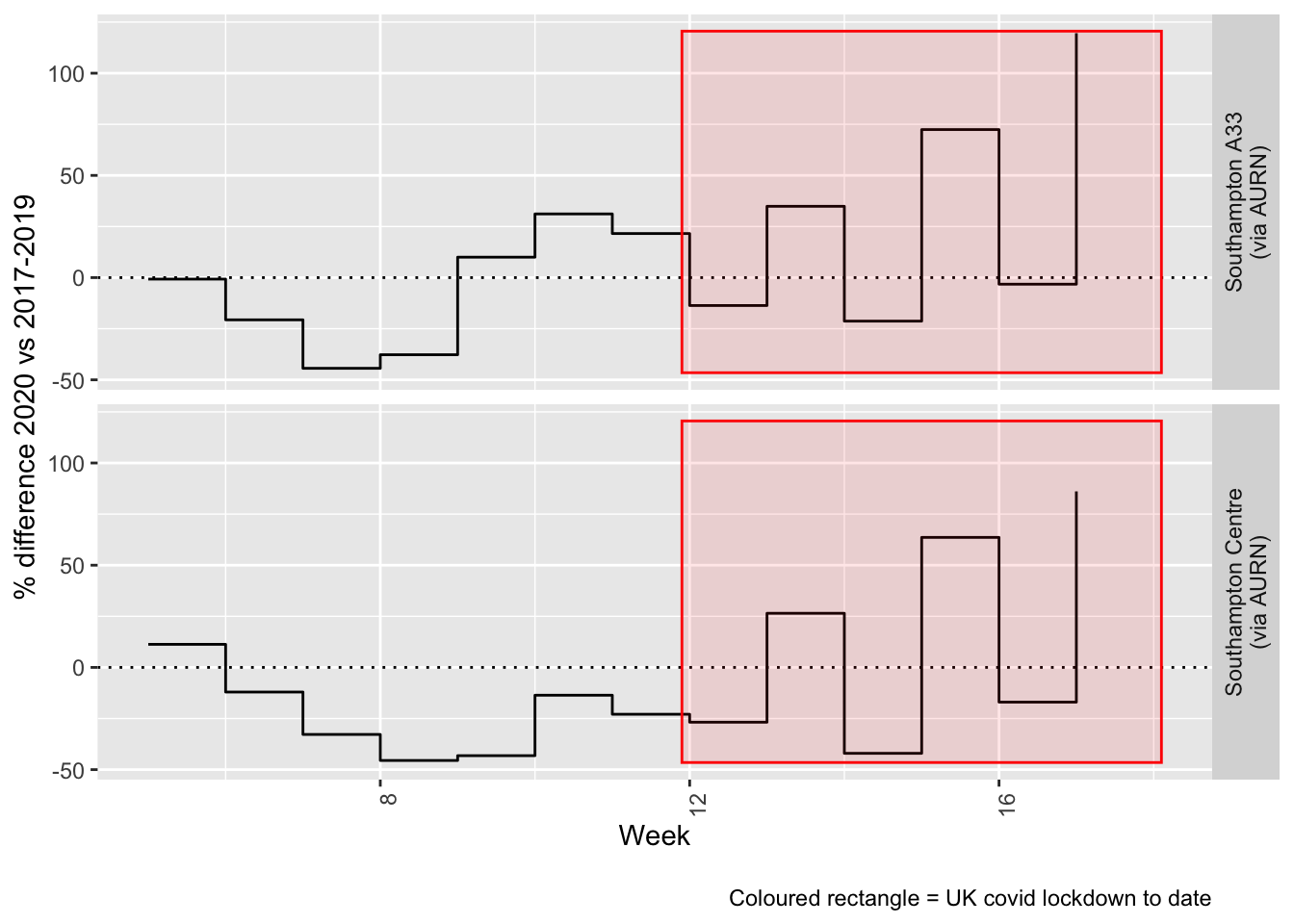
Figure 8.5: % difference in weekly mean PM10 levels 2020 vs 2017-2019, Southampton
Beware seasonal trends and meteorological effects
9 PM 2.5
yLab <- "PM 2.5 (ug/m3)"
pm25dt <- fixedDT[pollutant == "pm2.5"]
Figure 9.1 shows the most recent hourly data.
recentDT <- pm25dt[!is.na(value) & obsDate > myParams$recentCutDate]
p <- makeDotPlot(recentDT, xVar = "dateTimeUTC", yVar = "value", byVar = "site", yLab = yLab)

p <- p + scale_x_datetime(date_breaks = "2 day", date_labels = "%a %d %b") + theme(axis.text.x = element_text(angle = 90,
    hjust = 1)) + labs(caption = paste0(myParams$lockdownCap, myParams$weekendCap, myParams$noThresh))

yMax <- max(recentDT$value)
yMin <- min(recentDT$value)
p <- addLockdownDateTime(p, yMin, yMax)
addWeekendsDateTime(p, yMin, yMax)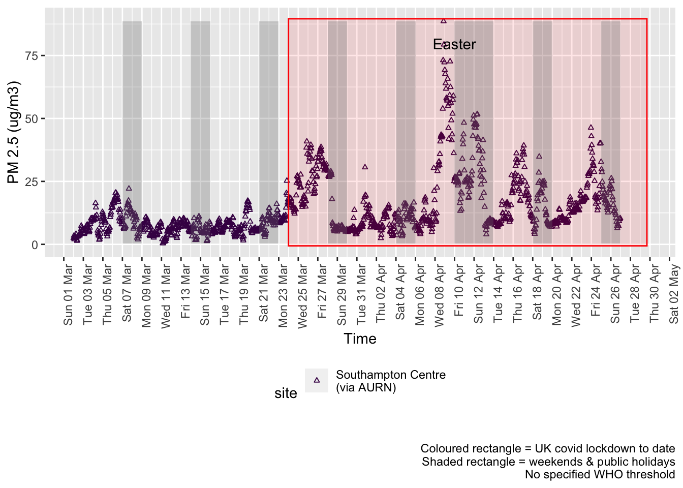
Figure 9.1: PM2.5 levels, Southampton (hourly, recent)
Figure 9.2 shows the most recent hourly data by date and time of day.
recentDT[, `:=`(time, hms::as_hms(dateTimeUTC))]

yMin <- min(recentDT$time)
yMax <- max(recentDT$time)
p <- profileTilePlot(recentDT, yLab)
addWeekendsDate(p, yMin, yMax) + labs(caption = paste0(myParams$lockdownCap, myParams$weekendCap))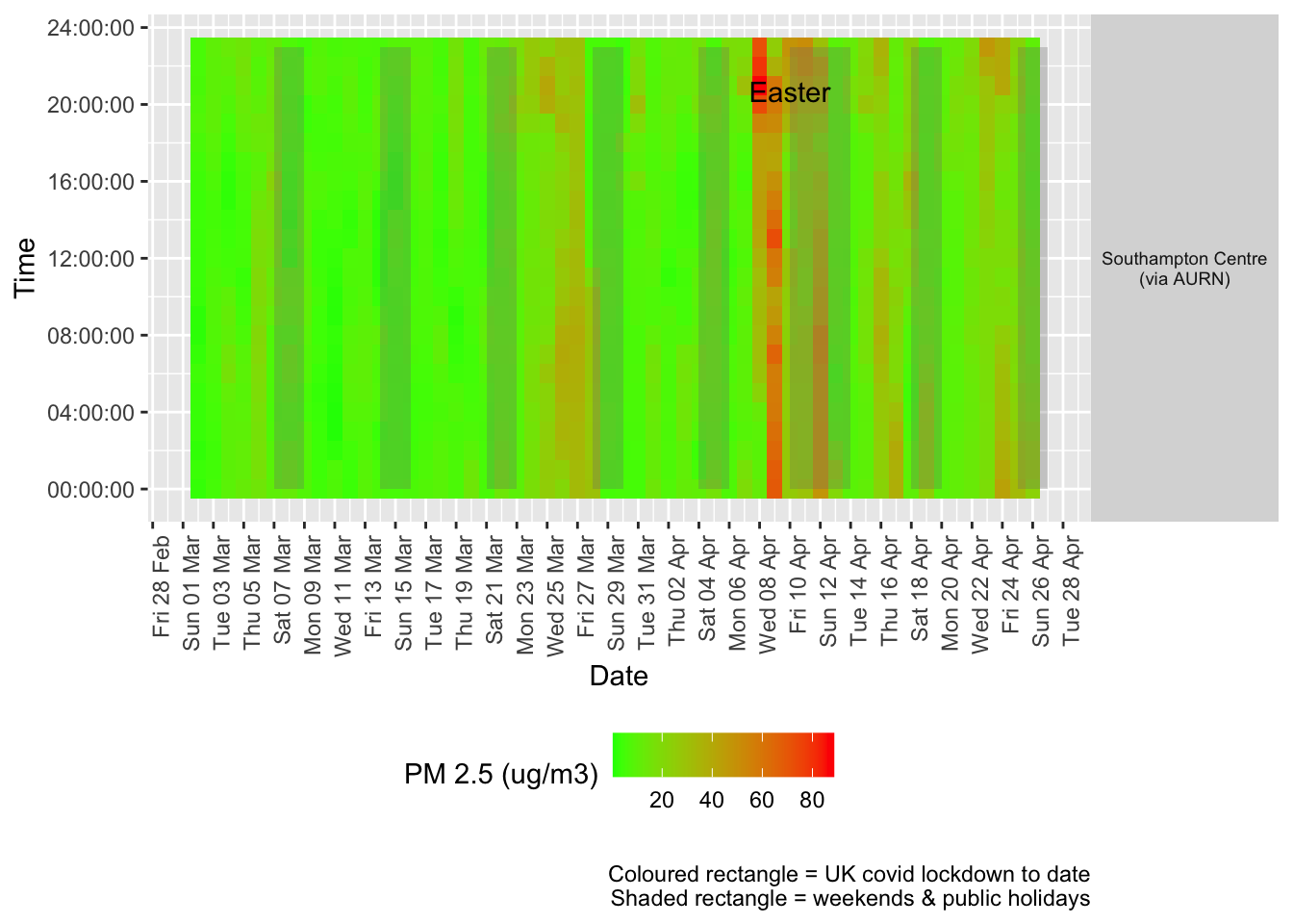
Figure 9.2: PM2.5 levels, Southampton (hourly, recent)
Figure 9.3 shows the most recent mean daily values compared to previous years.
plotDT <- pm25dt[site %like% "via AURN" & fixedDate <= lubridate::today() & fixedDate >= myParams$comparePlotCut,
    .(meanVal = mean(value), medianVal = median(value), nSites = uniqueN(site)), keyby = .(fixedDate,
        compareYear, site)]

# final plot - adds annotations
yMin <- min(plotDT$mean)
yMax <- max(plotDT$mean)

p <- compareYearsPlot(plotDT, xVar = "fixedDate", yVar = "meanVal", colVar = "compareYear")
p <- addLockdownDate(p, yMin, yMax) + geom_hline(yintercept = myParams$dailyPm2.5Threshold_WHO) +
    labs(x = "Date", y = "Daily mean", caption = paste0(myParams$lockdownCap, myParams$weekendCap,
        "\nReference line = WHO daily threshold (", myParams$dailyPm2.5Threshold_WHO, ")"))
p <- addWeekendsDate(p, yMin, yMax)
p + facet_grid(site ~ .) + theme(strip.text.y.right = element_text(angle = 90))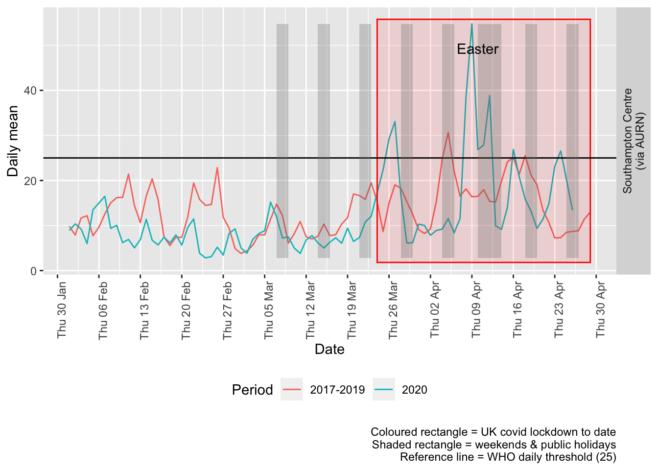
Figure 9.3: PM2.5 levels, Southampton (daily mean)
Figure 9.4 and 9.5 show the % difference between the daily and weekly means for 2020 vs 2017-2019 (reference period).
compareYearsDiffPlotDaily(pm25dt[site %like% "via AURN" & fixedDate >= myParams$comparePlotCut]) +
    labs(caption = paste0(myParams$lockdownCap, myParams$weekendCap))
## [1] "Max drop %:-81"
## [1] "Max increase %:264"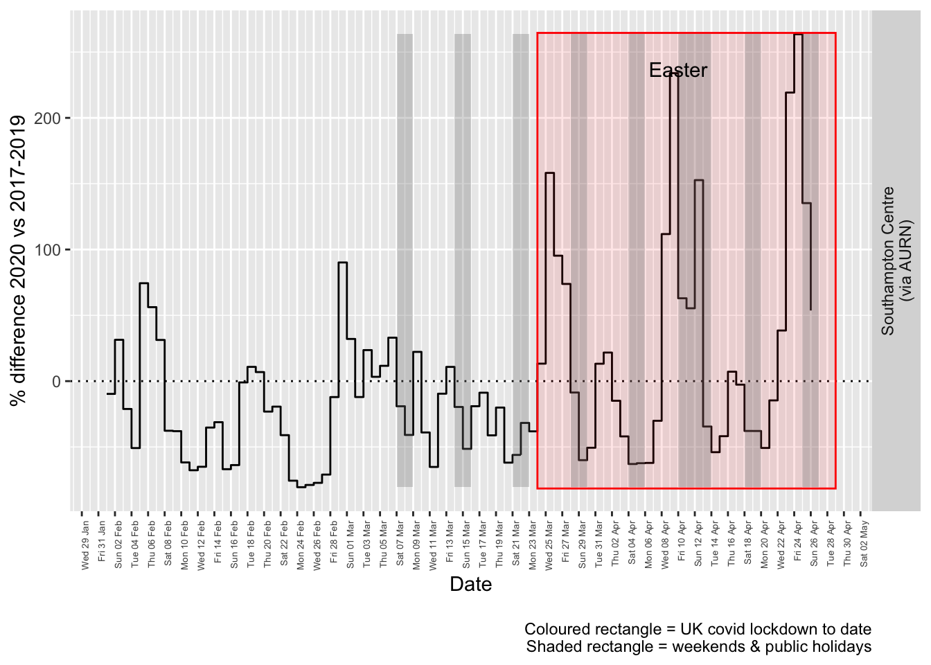
Figure 9.4: % difference in daily mean PM2.5 levels 2020 vs 2017-2019, Southampton
compareYearsDiffPlotWeekly(pm25dt[site %like% "via AURN" & fixedDate >= myParams$comparePlotCut]) +
    labs(caption = paste0(myParams$lockdownCap))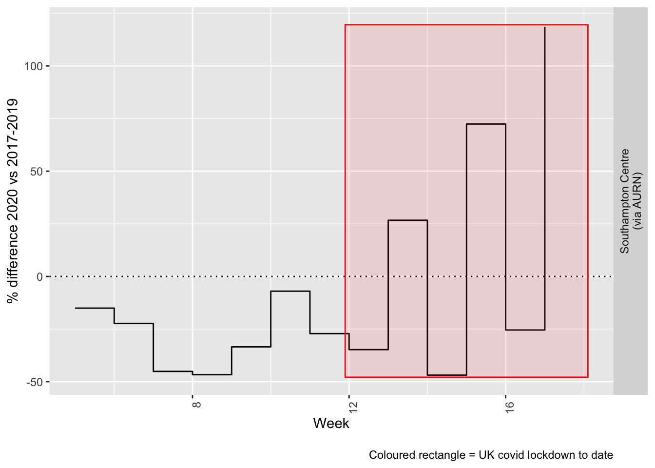
Figure 9.5: % difference in weekly mean PM2.5 levels 2020 vs 2017-2019, Southampton
Beware seasonal trends and meteorological effects
10 Wind direction and speed
As noted above, air pollution levels in any given time period are highly dependent on the prevailing meteorological conditions.
Figure 10.1 shows the wind direction and speed over the period of lockdown and can be compared with the equivalent pollutant level plots above such as Figure 4.1.
# windDT[, .(mean = mean(wd)), keyby = .(site)] # they're identical across AURN sites
windDirDT <- fixedDT[pollutant == "wd" & site %like% "A33"]
windDirDT[, `:=`(wd, value)]
setkey(windDirDT, dateTimeUTC, site, source)
windSpeedDT <- fixedDT[pollutant == "ws" & site %like% "A33"]
windSpeedDT[, `:=`(ws, value)]
setkey(windSpeedDT, dateTimeUTC, site, source)

windDT <- windSpeedDT[windDirDT]
windDT[, `:=`(rTime, hms::as_hms(dateTimeUTC))]
p <- ggplot2::ggplot(windDT[obsDate > as.Date("2020-03-23")], aes(x = dateTimeUTC, y = ws, angle = -wd +
    90, colour = ws)) + geom_text(label = "→") + theme(legend.position = "bottom") + guides(colour = guide_legend(title = "Wind speed")) +
    scale_color_continuous(high = "#132B43", low = "#56B1F7")  # normal blue reversed


yMin <- min(windDT[obsDate > as.Date("2020-03-23")]$ws)
yMax <- max(windDT[obsDate > as.Date("2020-03-23")]$ws)
p <- addWeekendsDateTime(p, yMin, yMax)
# p <- addLockdownDateTime(p, yMin, yMax)
p <- p + labs(y = "Wind speed", x = "Time", caption = paste0(myParams$weekendCap)) + theme(axis.text.x = element_text(angle = 90,
    hjust = 1, size = 9))
p + xlim(lubridate::as_datetime("2020-03-23 23:59:59"), NA)  # do this last otherwise adding the weekends takes the plot back to the earliest weekend we annotate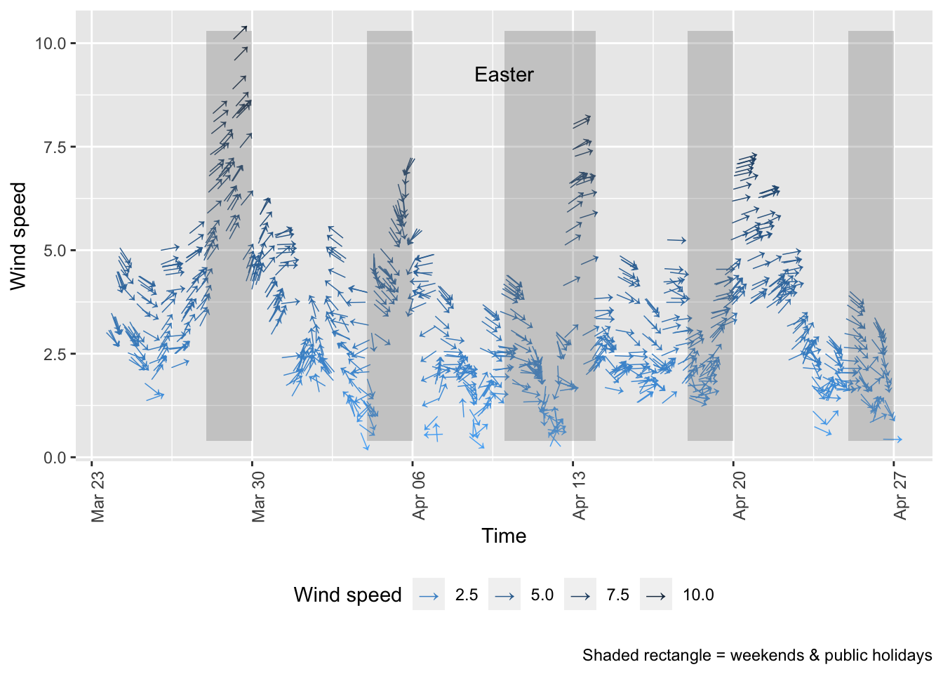
Figure 10.1: Wind direction and speed in Southampton since 23rd March 2020
Figure 10.2 shows a windrose for each of the periods of low/high pollutant levels visible in Figure 4.4:
- 26 March - 4 April (lower NO2)
- 7 April - 12 April (higher NO2)
- 16 April - 23 April (lower NO2)
The windroses indicate the direction the prevailing wind was blowing from and the colour of the ‘paddles’ indicates the strength while the length of the paddles indicates the proportion of observations. As we can see there are clear differences in the wind conditions which correlate with the pollution patterns observed:
- the first period with low NO2 was dominated by north-north easterly winds (likely to bring city and motorway air);
- the second period when NO2 and particulates were high was dominated by low speed south easterly winds (bringing continental air);
- the third period when NO2 was low was again dominated by north easterly winds.
sotonAirDT[, `:=`(aqPeriod, ifelse(obsDate >= as.Date("2020-03-26") & obsDate <= as.Date("2020-04-04"),
    "Period 1 - Low: 26/3 - 4/4", NA))]
sotonAirDT[, `:=`(aqPeriod, ifelse(obsDate >= as.Date("2020-04-07") & obsDate <= as.Date("2020-04-12"),
    "Period 2 - High: 7/4 - 12/4", aqPeriod))]
sotonAirDT[, `:=`(aqPeriod, ifelse(obsDate >= as.Date("2020-04-16") & obsDate <= as.Date("2020-04-23"),
    "Period 3 - Low: 16/4 - 23/4", aqPeriod))]

plotDT <- sotonAirDT[!is.na(aqPeriod) & (pollutant == "ws" | pollutant == "wd") & site %like% "A33"]

t <- plotDT[, .(start = min(dateTimeUTC), end = max(dateTimeUTC)), keyby = .(aqPeriod)]

kableExtra::kable(t, caption = "Check period start/end times") %>% kable_styling()| aqPeriod | start | end |
|---|---|---|
| Period 1 - Low: 26/3 - 4/4 | 2020-03-26 | 2020-04-04 23:00:00 |
| Period 2 - High: 7/4 - 12/4 | 2020-04-07 | 2020-04-12 23:00:00 |
| Period 3 - Low: 16/4 - 23/4 | 2020-04-16 | 2020-04-23 23:00:00 |
# make a dt openair will accept
wdDT <- plotDT[pollutant == "wd", .(dateTimeUTC, site, wd = value, aqPeriod)]
setkey(wdDT, dateTimeUTC, site, aqPeriod)
wsDT <- plotDT[pollutant == "ws", .(dateTimeUTC, site, ws = value, aqPeriod)]
setkey(wsDT, dateTimeUTC, site, aqPeriod)
wrDT <- wdDT[wsDT]
openair::windRose(wrDT, type = "aqPeriod")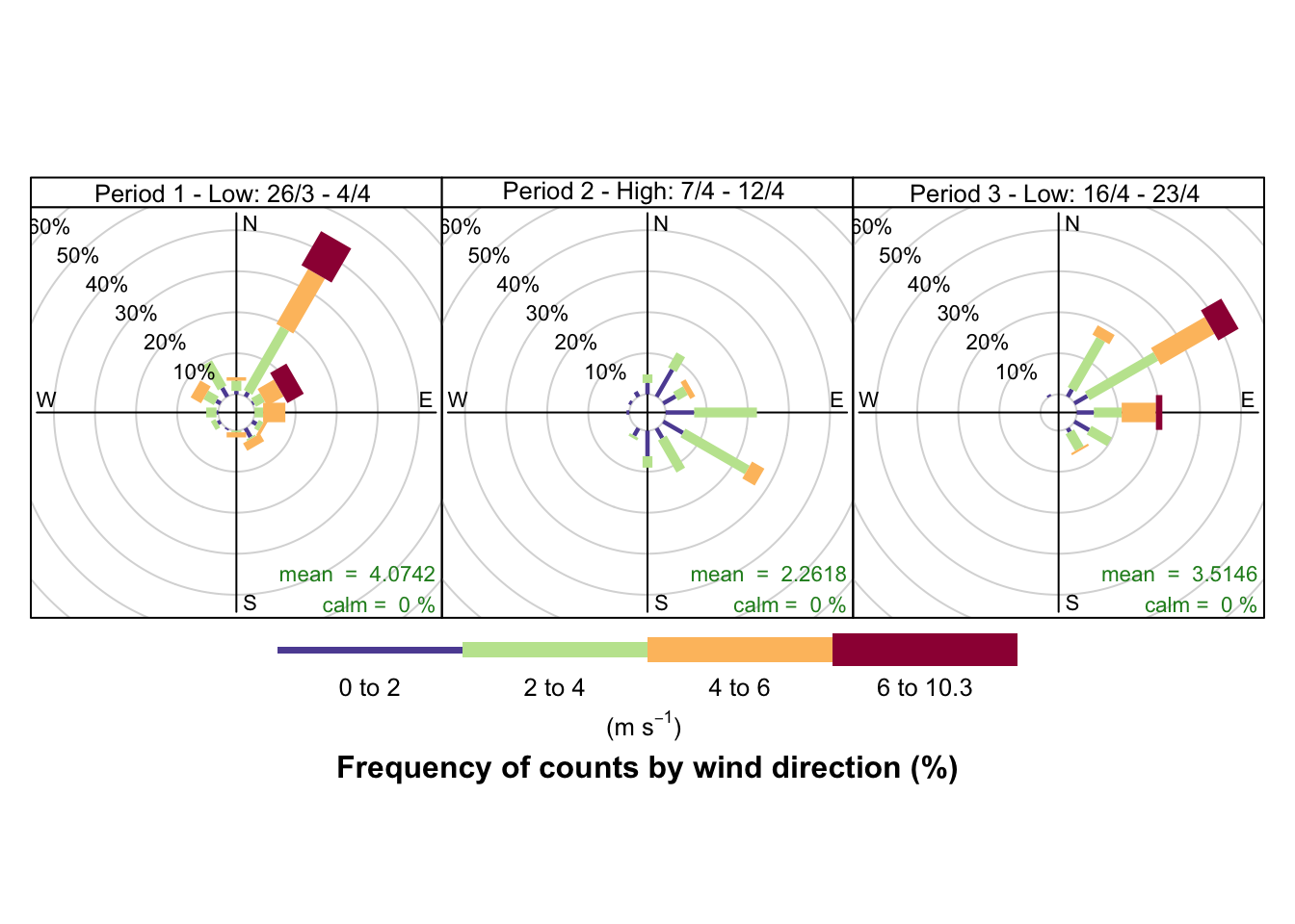
Figure 10.2: Wind rose for Southampton sites since 23rd March 2020
11 Save data
Save data out for predictive models.
Save long form data to data folder.
fixedDT[, `:=`(weekDay, lubridate::wday(dateTimeUTC, label = TRUE, abbr = TRUE))]
f <- paste0(here::here(), "/data/sotonExtract2017_2020_v2.csv")
data.table::fwrite(fixedDT, f)
dkUtils::gzipIt(f)
Saved data description:
skimr::skim(aurnDT)| Name | aurnDT |
| Number of rows | 885672 |
| Number of columns | 9 |
| _______________________ | |
| Column type frequency: | |
| character | 6 |
| Date | 1 |
| numeric | 1 |
| POSIXct | 1 |
| ________________________ | |
| Group variables | None |
Variable type: character
| skim_variable | n_missing | complete_rate | min | max | empty | n_unique | whitespace |
|---|---|---|---|---|---|---|---|
| date | 0 | 1 | 20 | 20 | 0 | 43848 | 0 |
| code | 0 | 1 | 4 | 4 | 0 | 2 | 0 |
| site | 0 | 1 | 15 | 18 | 0 | 2 | 0 |
| pollutant | 0 | 1 | 2 | 5 | 0 | 13 | 0 |
| ratified | 0 | 1 | 1 | 1 | 0 | 1 | 0 |
| source | 0 | 1 | 4 | 4 | 0 | 1 | 0 |
Variable type: Date
| skim_variable | n_missing | complete_rate | min | max | median | n_unique |
|---|---|---|---|---|---|---|
| obsDate | 0 | 1 | 2016-01-01 | 2020-12-31 | 2018-05-28 | 1827 |
Variable type: numeric
| skim_variable | n_missing | complete_rate | mean | sd | p0 | p25 | p50 | p75 | p100 | hist |
|---|---|---|---|---|---|---|---|---|---|---|
| value | 231714 | 0.74 | 41.53 | 74.4 | -9.6 | 3.95 | 12.2 | 37.4 | 1007.78 | ▇▁▁▁▁ |
Variable type: POSIXct
| skim_variable | n_missing | complete_rate | min | max | median | n_unique |
|---|---|---|---|---|---|---|
| dateTimeUTC | 0 | 1 | 2016-01-01 | 2020-12-31 23:00:00 | 2018-05-28 15:00:00 | 43848 |
Saved data sites by year:
t <- table(fixedDT$site, fixedDT$year)

kableExtra::kable(t, caption = "Sites available by year") %>% kable_styling()| 2017 | 2018 | 2019 | 2020 | |
|---|---|---|---|---|
| Southampton - Onslow Road (near RSH) | 25307 | 25755 | 24762 | 6408 |
| Southampton - Victoria Road (Woolston) | 19251 | 23091 | 11541 | 6195 |
| Southampton A33 (via AURN) | 67278 | 62214 | 65751 | 18782 |
| Southampton Centre (via AURN) | 103806 | 100155 | 105871 | 24902 |
Saved pollutants by site:
t <- table(fixedDT$site, fixedDT$pollutant)

kableExtra::kable(t, caption = "Pollutants available by site") %>% kable_styling()| no | no2 | nox | nv10 | nv2.5 | o3 | pm10 | pm2.5 | so2 | v10 | v2.5 | wd | ws | |
|---|---|---|---|---|---|---|---|---|---|---|---|---|---|
| Southampton - Onslow Road (near RSH) | 27412 | 27408 | 27412 | 0 | 0 | 0 | 0 | 0 | 0 | 0 | 0 | 0 | 0 |
| Southampton - Victoria Road (Woolston) | 20026 | 20026 | 20026 | 0 | 0 | 0 | 0 | 0 | 0 | 0 | 0 | 0 | 0 |
| Southampton A33 (via AURN) | 28635 | 28633 | 28635 | 23227 | 0 | 0 | 24695 | 0 | 0 | 23224 | 0 | 28488 | 28488 |
| Southampton Centre (via AURN) | 27843 | 27843 | 27843 | 21105 | 22627 | 27644 | 25172 | 26694 | 27255 | 21105 | 22627 | 28488 | 28488 |
NB:
- ws = wind speed
- wd = wind direction
- v* = volatiles
We have also produced wind/pollution roses for these sites.
12 Annex
12.1 Missing data
Several of these datasets suffer from missing data or have stopped updating. This is visualised below for all data for all sites from January 2020.
# dt,xvar, yvar,fillVar, yLab
tileDT <- sotonAirDT[pollutant == "no2" & dateTimeUTC > as.Date("2020-02-01") & !is.na(value)]
p <- makeTilePlot(tileDT, xVar = "dateTimeUTC", yVar = "site", fillVar = "value", yLab = yLab)

p + scale_x_datetime(date_breaks = "7 day", date_labels = "%a %d %b") + theme(axis.text.x = element_text(angle = 90,
    hjust = 1))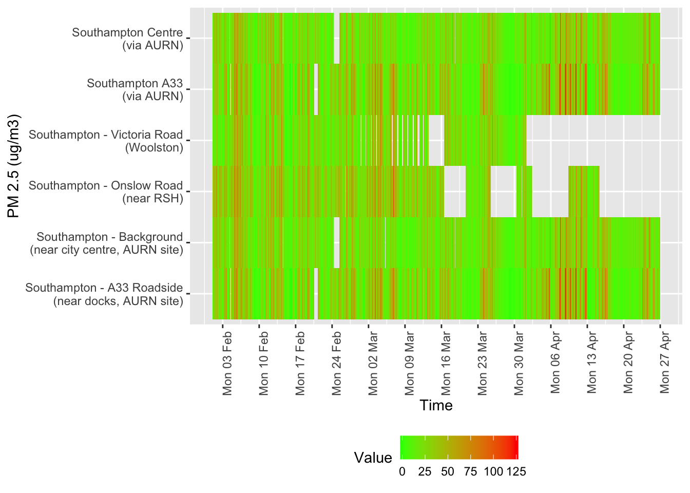
Figure 12.1: Nitrogen Dioxide data availability and levels over time
# dt,xvar, yvar,fillVar, yLab
tileDT <- sotonAirDT[pollutant == "nox" & dateTimeUTC > as.Date("2020-02-01") & !is.na(value)]
p <- makeTilePlot(tileDT, xVar = "dateTimeUTC", yVar = "site", fillVar = "value", yLab = yLab)

p + scale_x_datetime(date_breaks = "7 day", date_labels = "%a %d %b") + theme(axis.text.x = element_text(angle = 90,
    hjust = 1))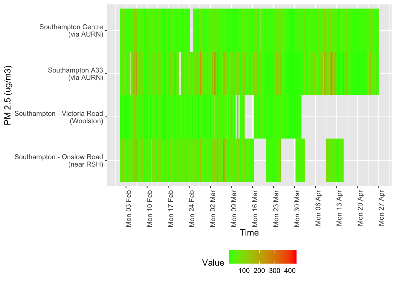
Figure 12.2: Oxides of nitrogen data availability and levels over time
# dt,xvar, yvar,fillVar, yLab
tileDT <- sotonAirDT[pollutant == "so2" & dateTimeUTC > as.Date("2020-02-01") & !is.na(value)]
p <- makeTilePlot(tileDT, xVar = "dateTimeUTC", yVar = "site", fillVar = "value", yLab = yLab)

p + scale_x_datetime(date_breaks = "7 day", date_labels = "%a %d %b") + theme(axis.text.x = element_text(angle = 90,
    hjust = 1))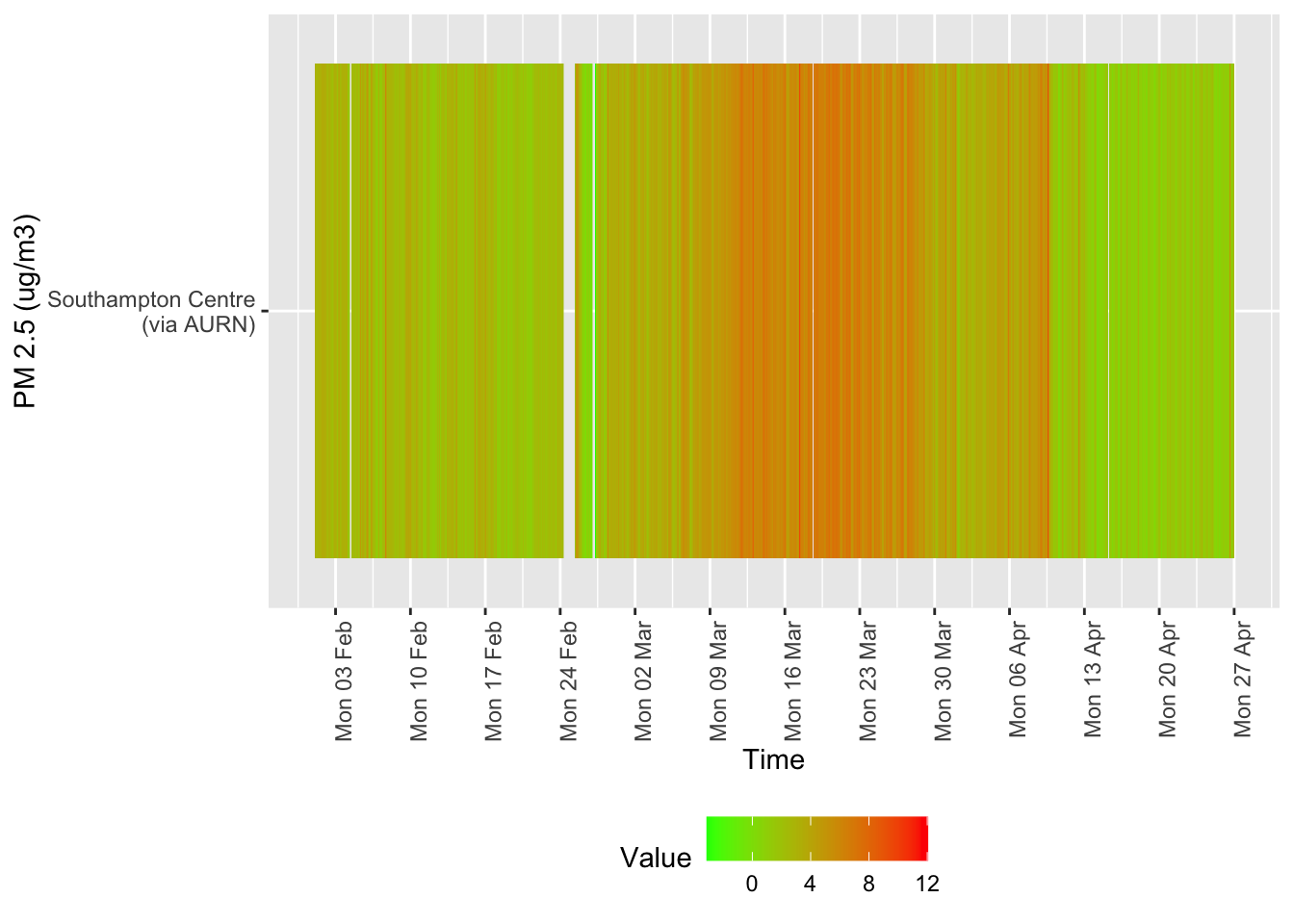
Figure 12.3: Sulphour Dioxide data availability and levels over time
tileDT <- sotonAirDT[pollutant == "o3" & dateTimeUTC > as.Date("2020-02-01") & !is.na(value)]
p <- makeTilePlot(tileDT, xVar = "dateTimeUTC", yVar = "site", fillVar = "value", yLab = yLab)

p + scale_x_datetime(date_breaks = "7 day", date_labels = "%a %d %b") + theme(axis.text.x = element_text(angle = 90,
    hjust = 1))
Figure 12.4: Availability and level of o3 data over time
tileDT <- sotonAirDT[pollutant == "pm10" & dateTimeUTC > as.Date("2020-02-01") & !is.na(value)]
p <- makeTilePlot(tileDT, xVar = "dateTimeUTC", yVar = "site", fillVar = "value", yLab = yLab)

p + scale_x_datetime(date_breaks = "7 day", date_labels = "%a %d %b") + theme(axis.text.x = element_text(angle = 90,
    hjust = 1))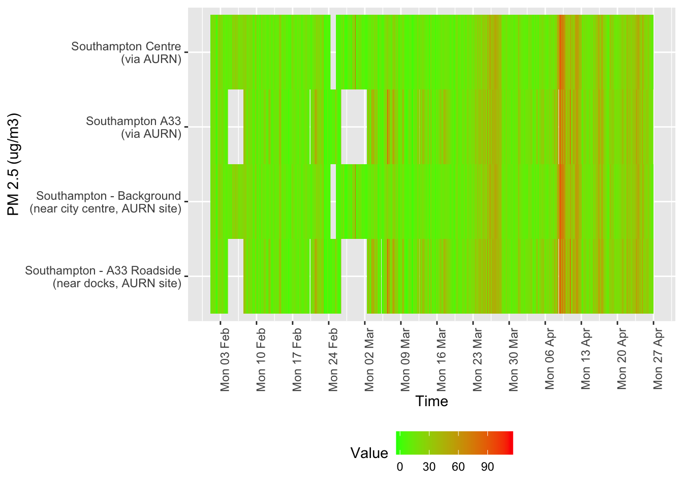
Figure 12.5: Availability and level of PM 10 data over time
tileDT <- sotonAirDT[pollutant == "pm2.5" & dateTimeUTC > as.Date("2020-02-01") & !is.na(value)]
p <- makeTilePlot(tileDT, xVar = "dateTimeUTC", yVar = "site", fillVar = "value", yLab = yLab)

p + scale_x_datetime(date_breaks = "7 day", date_labels = "%a %d %b") + theme(axis.text.x = element_text(angle = 90,
    hjust = 1))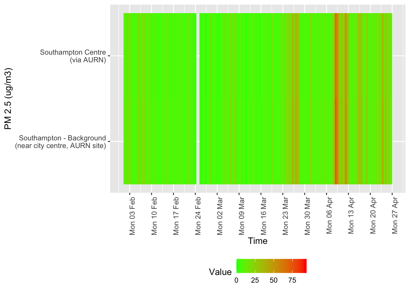
Figure 12.6: Availability and level of PM 2.5 data over time
13 Runtime
Report generated using knitr in RStudio with R version 3.6.3 (2020-02-29) running on x86_64-apple-darwin15.6.0 (Darwin Kernel Version 19.4.0: Wed Mar 4 22:28:40 PST 2020; root:xnu-6153.101.6~15/RELEASE_X86_64).
t <- proc.time() - myParams$startTime

elapsed <- t[[3]]
Analysis completed in 70.395 seconds ( 1.17 minutes).
R packages used in this report:
- data.table - (Dowle et al. 2015)
- ggplot2 - (Wickham 2009)
- here - (Müller 2017)
- kableExtra - (Zhu 2018)
- lubridate - (Grolemund and Wickham 2011)
- openAir - (Carslaw and Ropkins 2012)
- skimr - (Arino de la Rubia et al. 2017)
- viridis - (Garnier 2018)
References
Arino de la Rubia, Eduardo, Hao Zhu, Shannon Ellis, Elin Waring, and Michael Quinn. 2017. Skimr: Skimr. https://github.com/ropenscilabs/skimr.
Carslaw, David C., and Karl Ropkins. 2012. “Openair — an R Package for Air Quality Data Analysis.” Environmental Modelling & Software 27–28 (0): 52–61. https://doi.org/10.1016/j.envsoft.2011.09.008.
Dowle, M, A Srinivasan, T Short, S Lianoglou with contributions from R Saporta, and E Antonyan. 2015. Data.table: Extension of Data.frame. https://CRAN.R-project.org/package=data.table.
Garnier, Simon. 2018. Viridis: Default Color Maps from ’Matplotlib’. https://CRAN.R-project.org/package=viridis.
Grolemund, Garrett, and Hadley Wickham. 2011. “Dates and Times Made Easy with lubridate.” Journal of Statistical Software 40 (3): 1–25. http://www.jstatsoft.org/v40/i03/.
Müller, Kirill. 2017. Here: A Simpler Way to Find Your Files. https://CRAN.R-project.org/package=here.
Wickham, Hadley. 2009. Ggplot2: Elegant Graphics for Data Analysis. Springer-Verlag New York. http://ggplot2.org.
Zhu, Hao. 2018. KableExtra: Construct Complex Table with ’Kable’ and Pipe Syntax. https://CRAN.R-project.org/package=kableExtra.
1.2 Comments and feedback
If you wish to comment please open an issue: